The Client
Caledonia Park
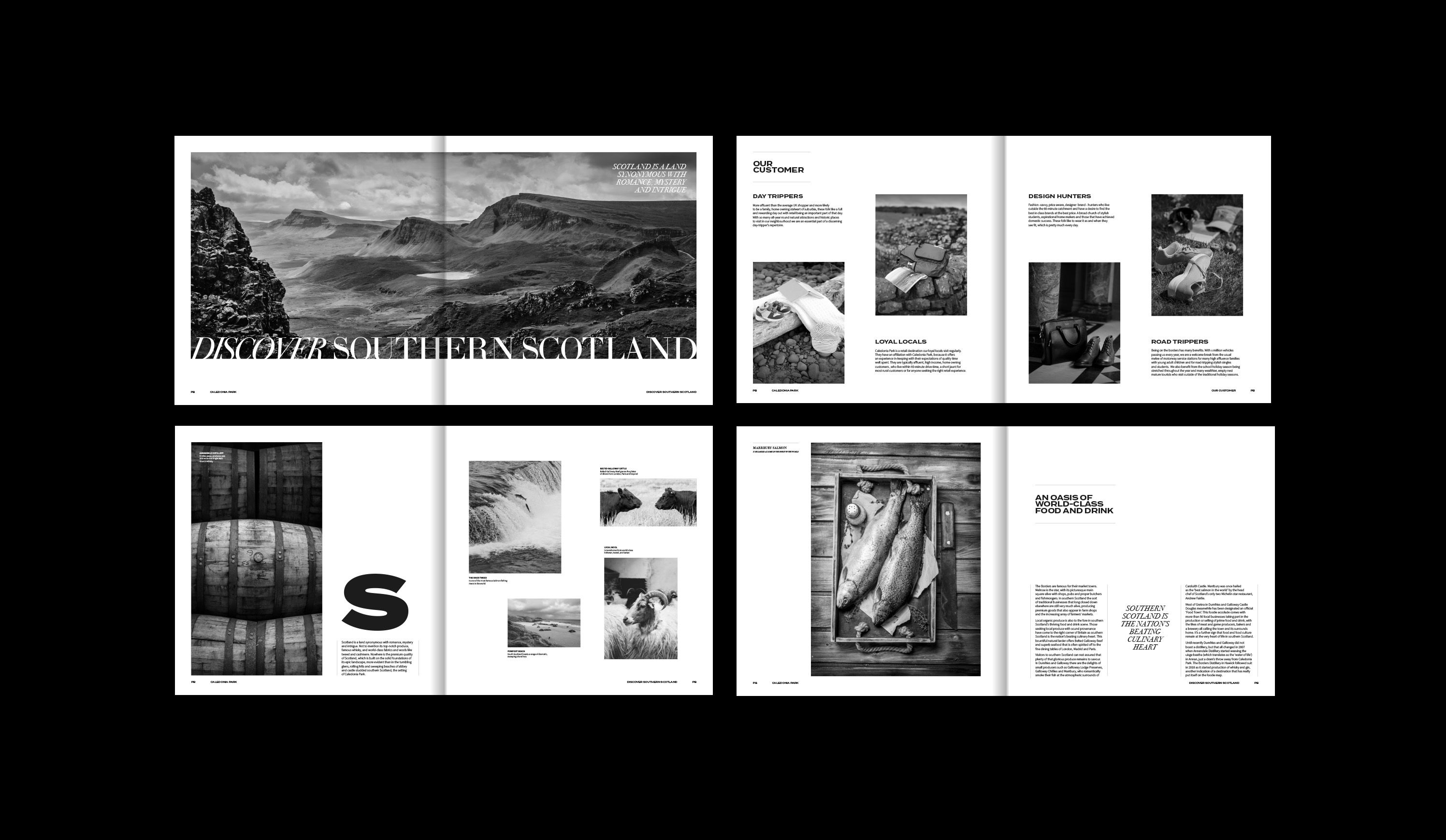
Brand identity + guidelines + art direction + brochure design
Positioning
Potential
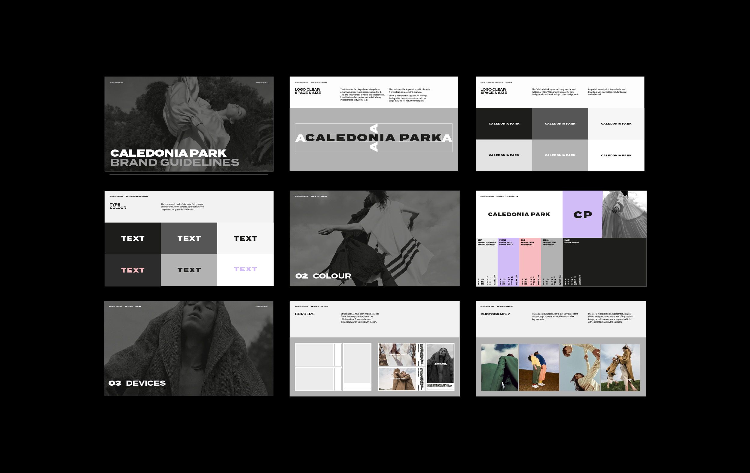
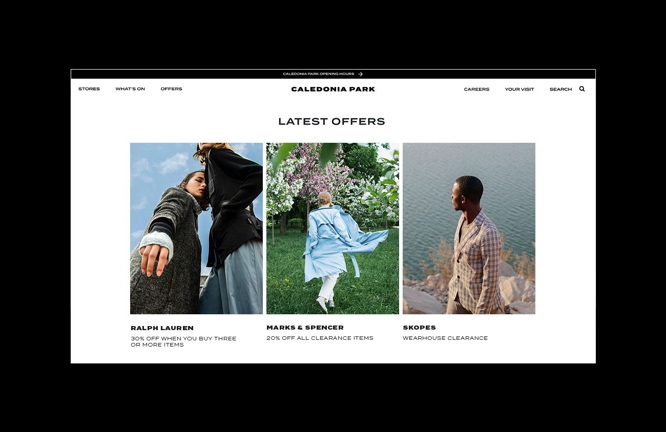
Caledonia park previously gretna gateway, were looking to evolve, to create a new chapter in their history—one that put them on the map as a must stop retail destination. As this major retail outlet began a new era of transformation it required a brand to go with it, so, work commenced with cp's strategic positioning with the objective to positioning cp as a brand— a leader in its own right. What was evidently clear was that the world's best retailers (liberty, selfridges, browns) don’t hide behind their stockists' brand identities. They all have an ownable identity with individual type styles, recognisable photography and consistent device usage— this was undoubtedly the way cp should be thinking too.
Nature
fuelling modern luxury
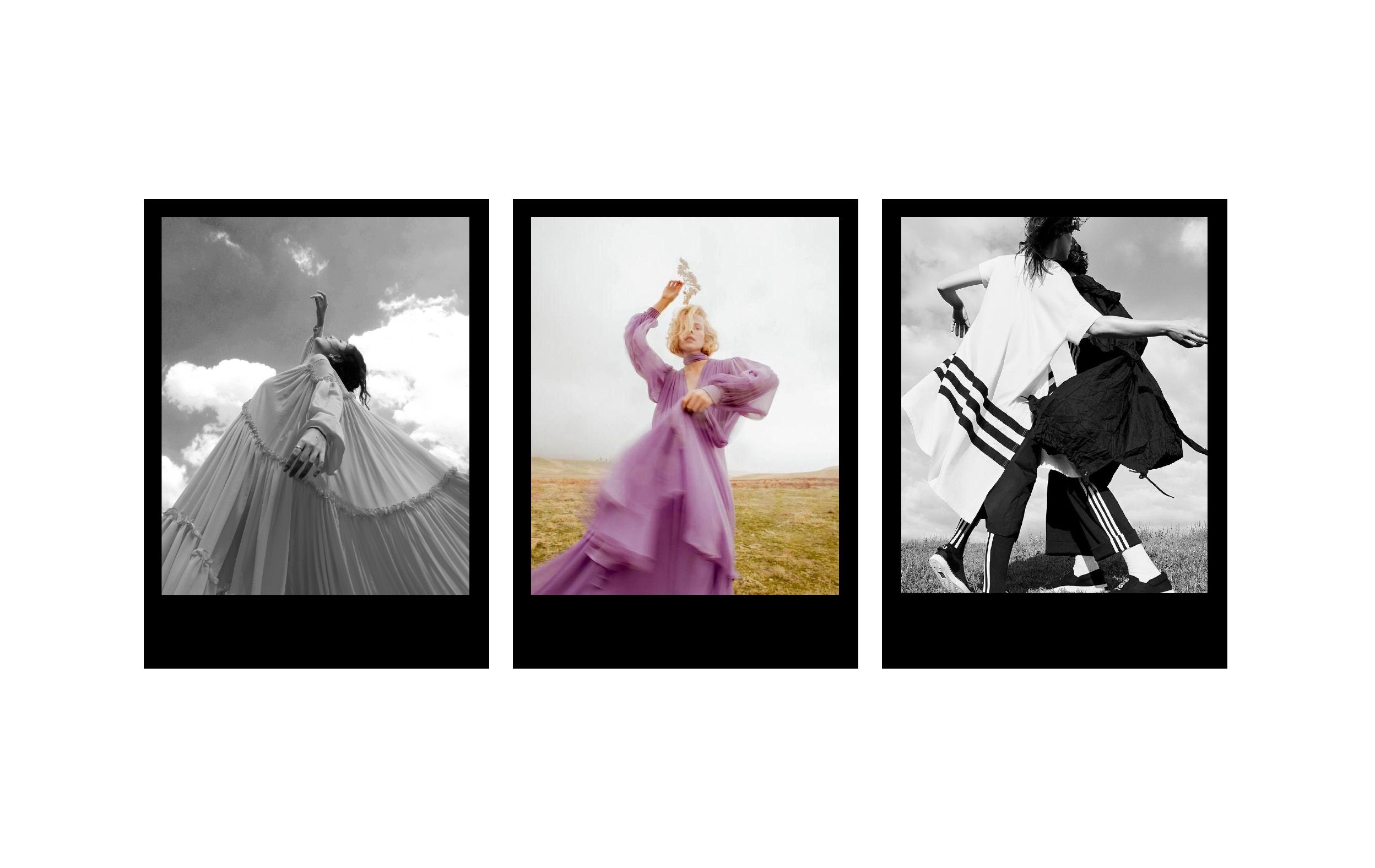
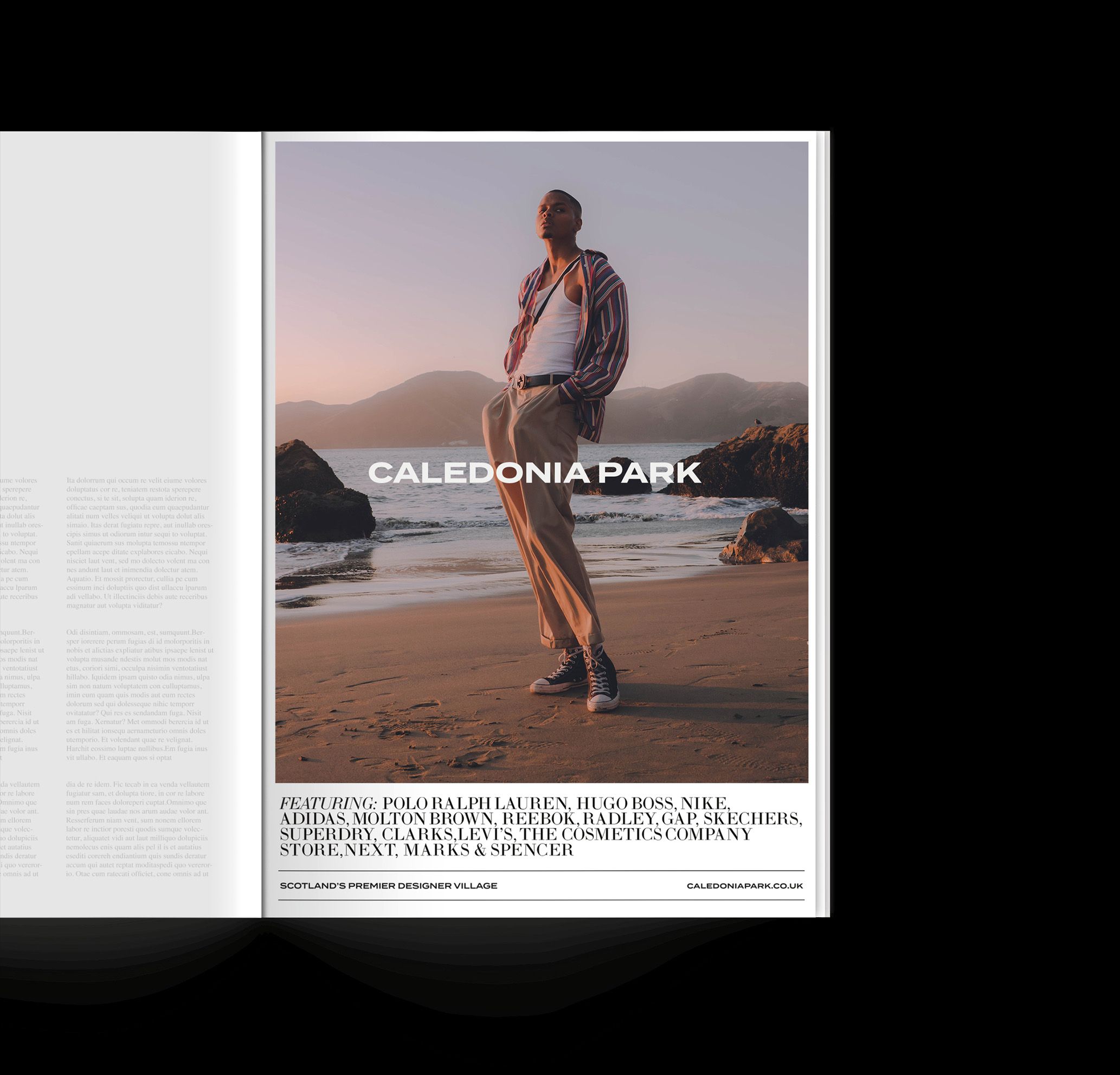
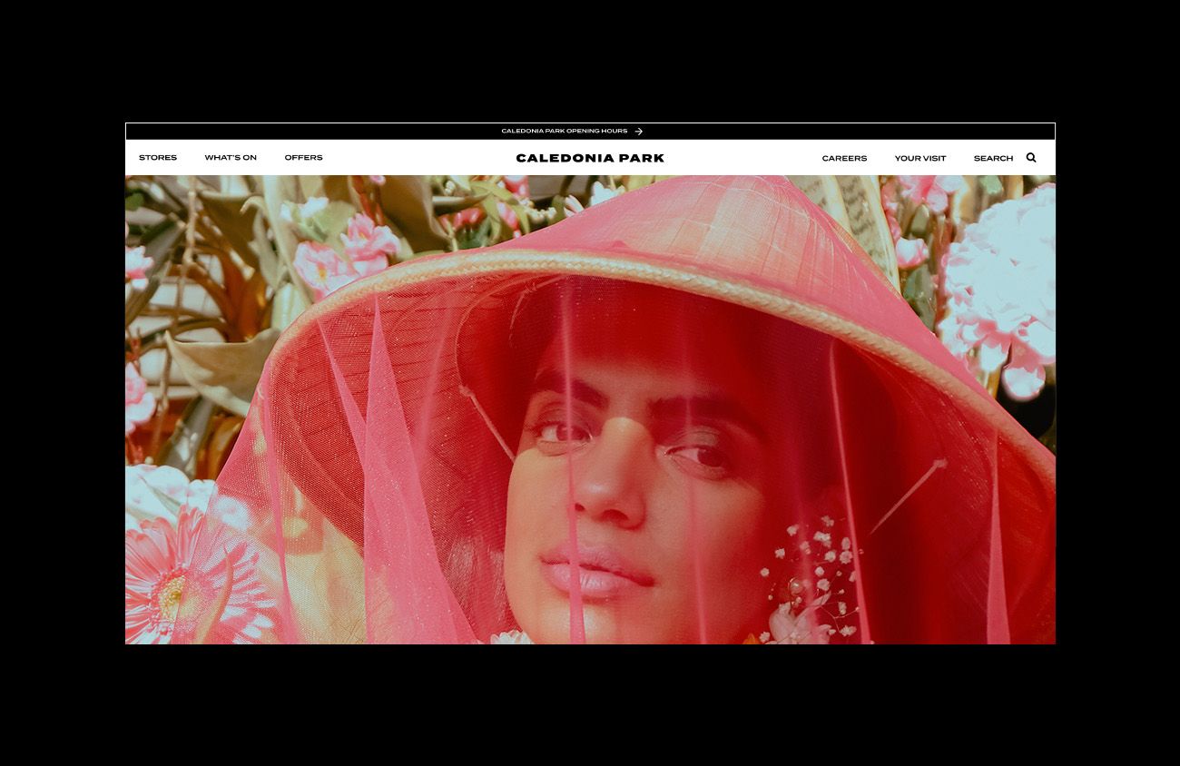
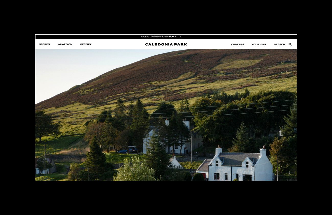
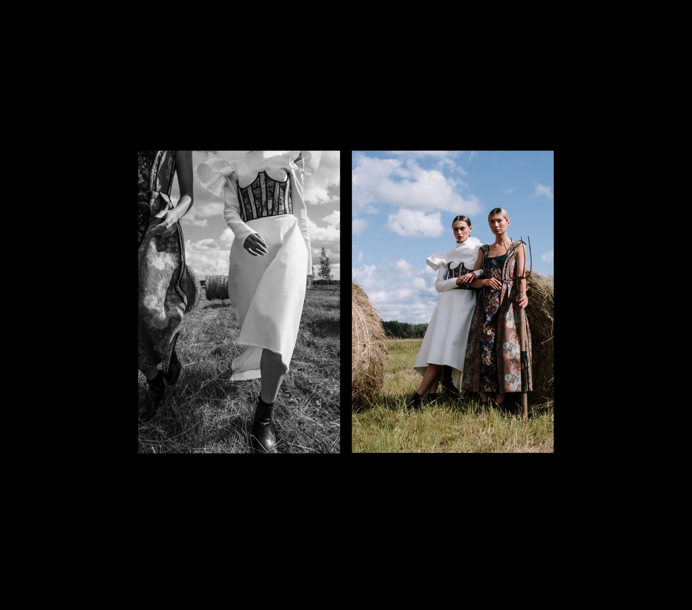
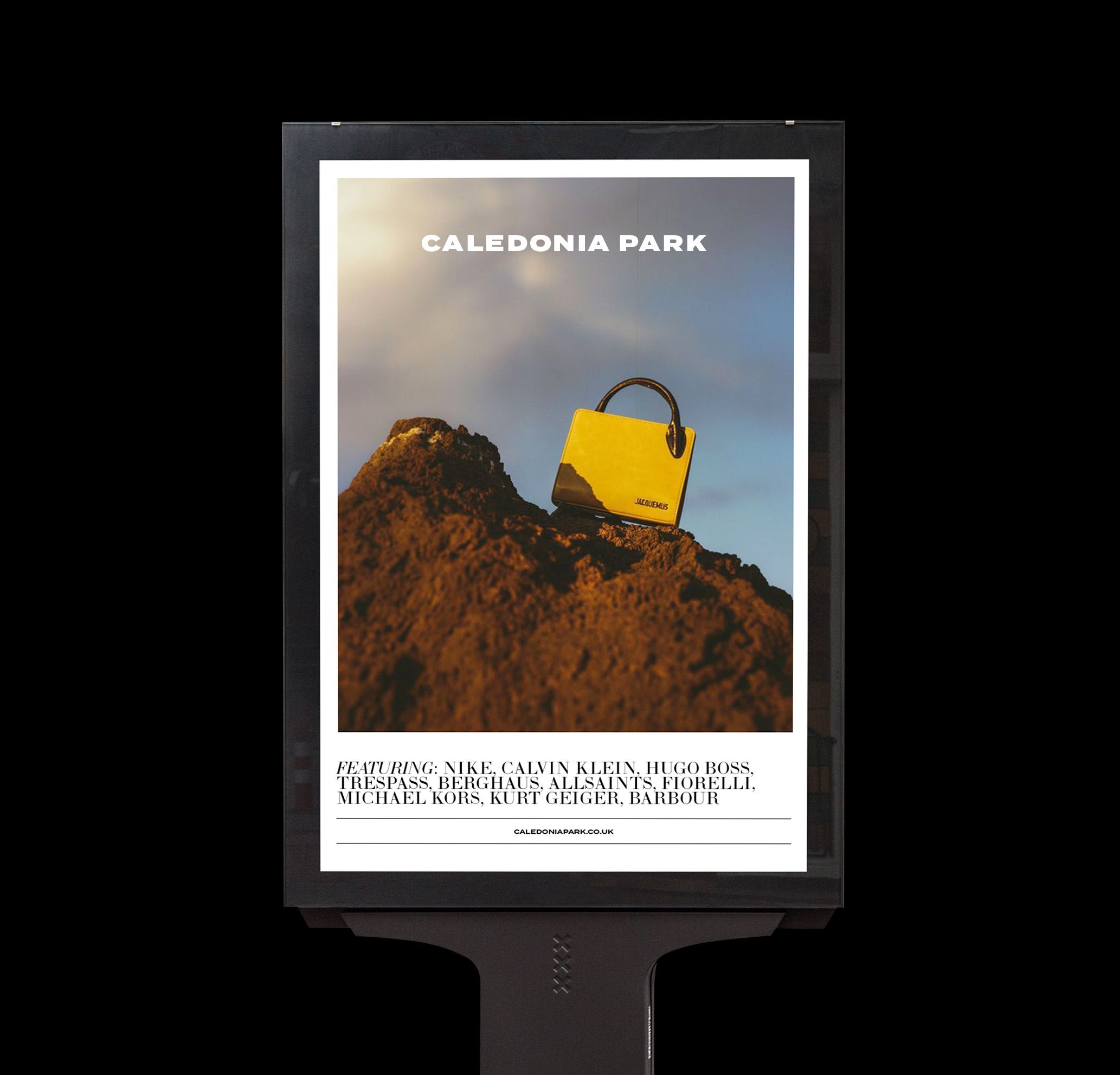
The blend of designer brands and rural destinations has allowed caledonia park to stand out against other designer outlets, and to position itself as a leader in its field. We had a genuine opportunity to capture the innate beauty of the scottish lowlands with high-end fashion brands.
A Quiet
Retail Revolution
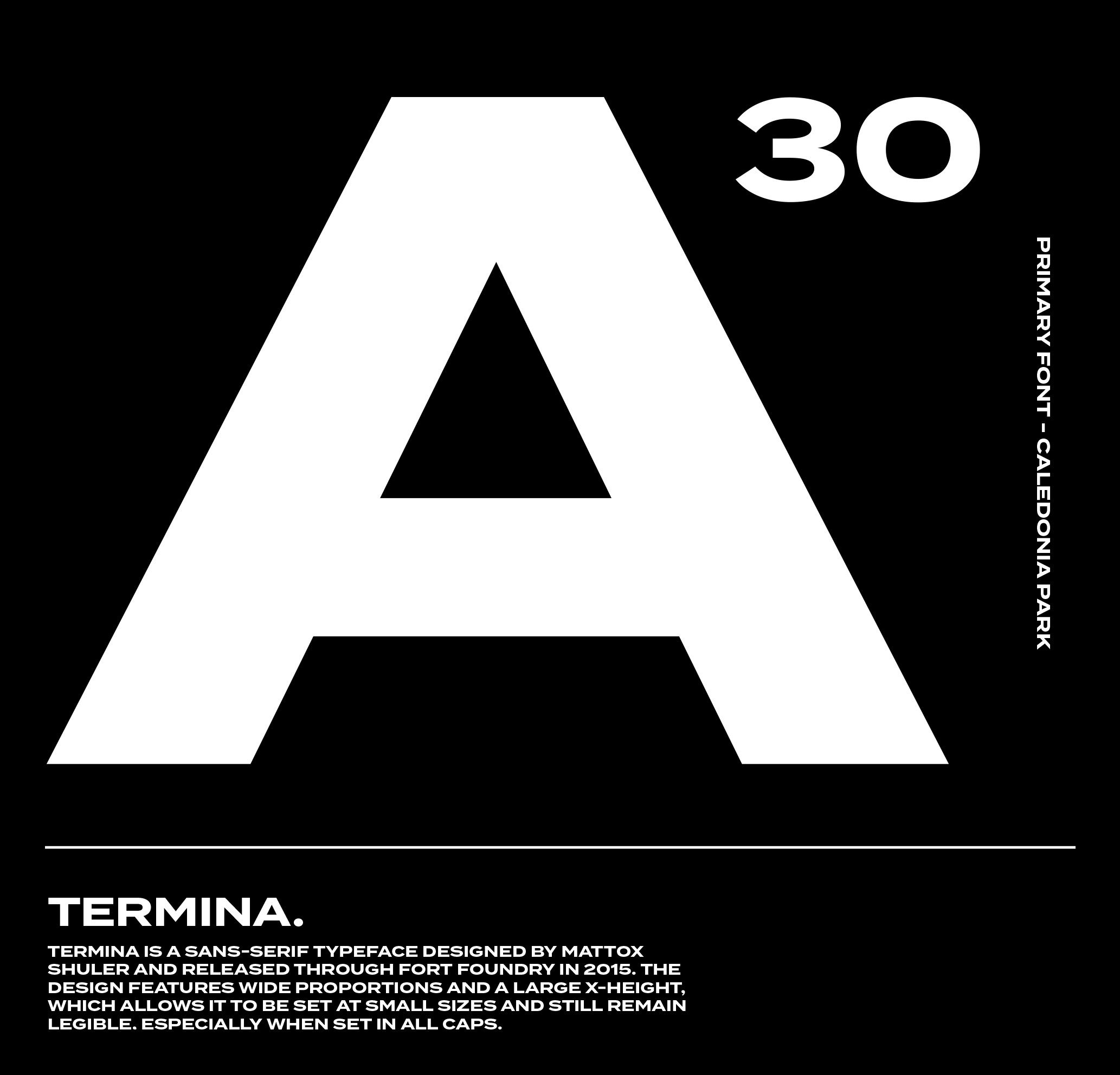
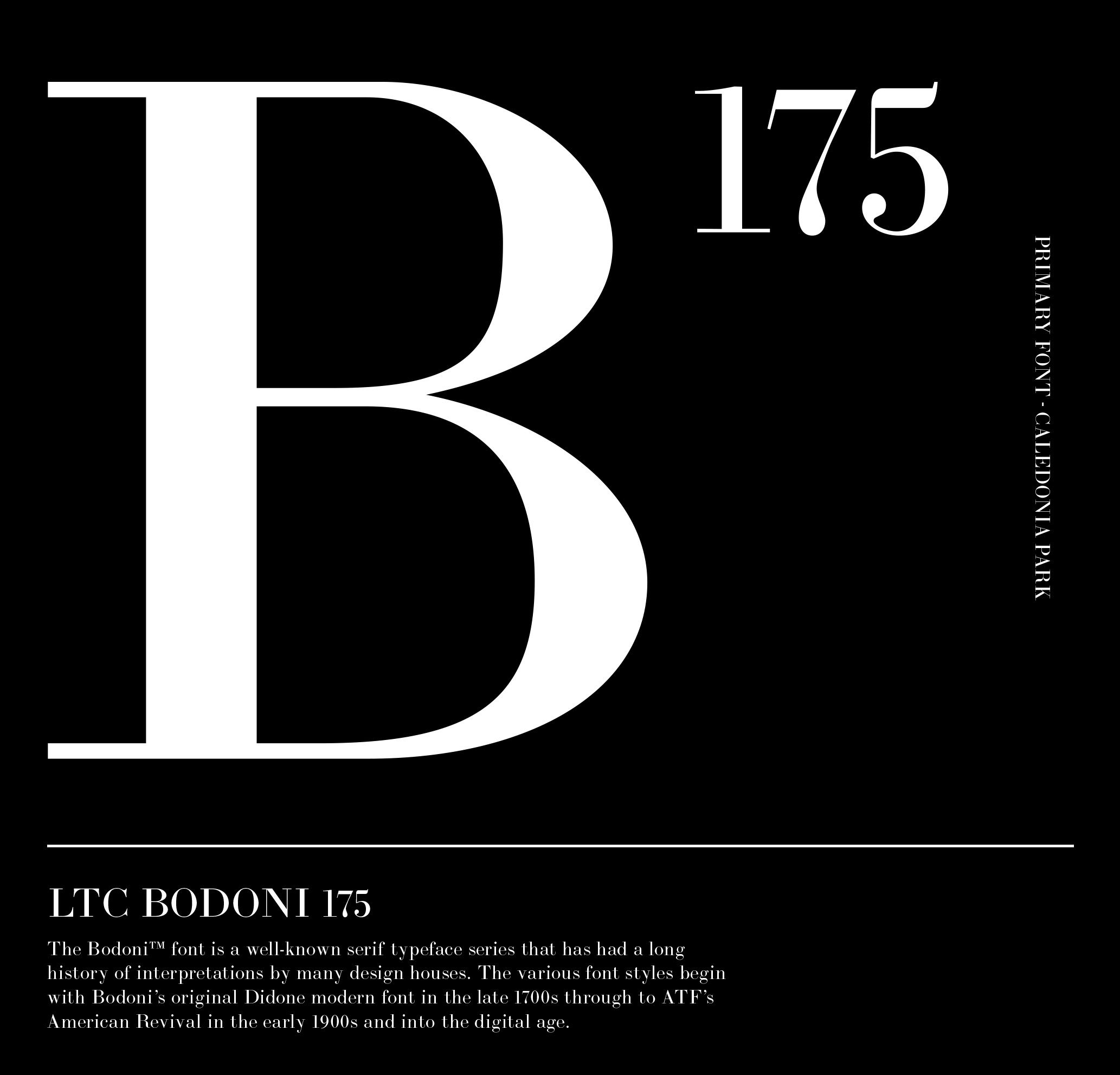
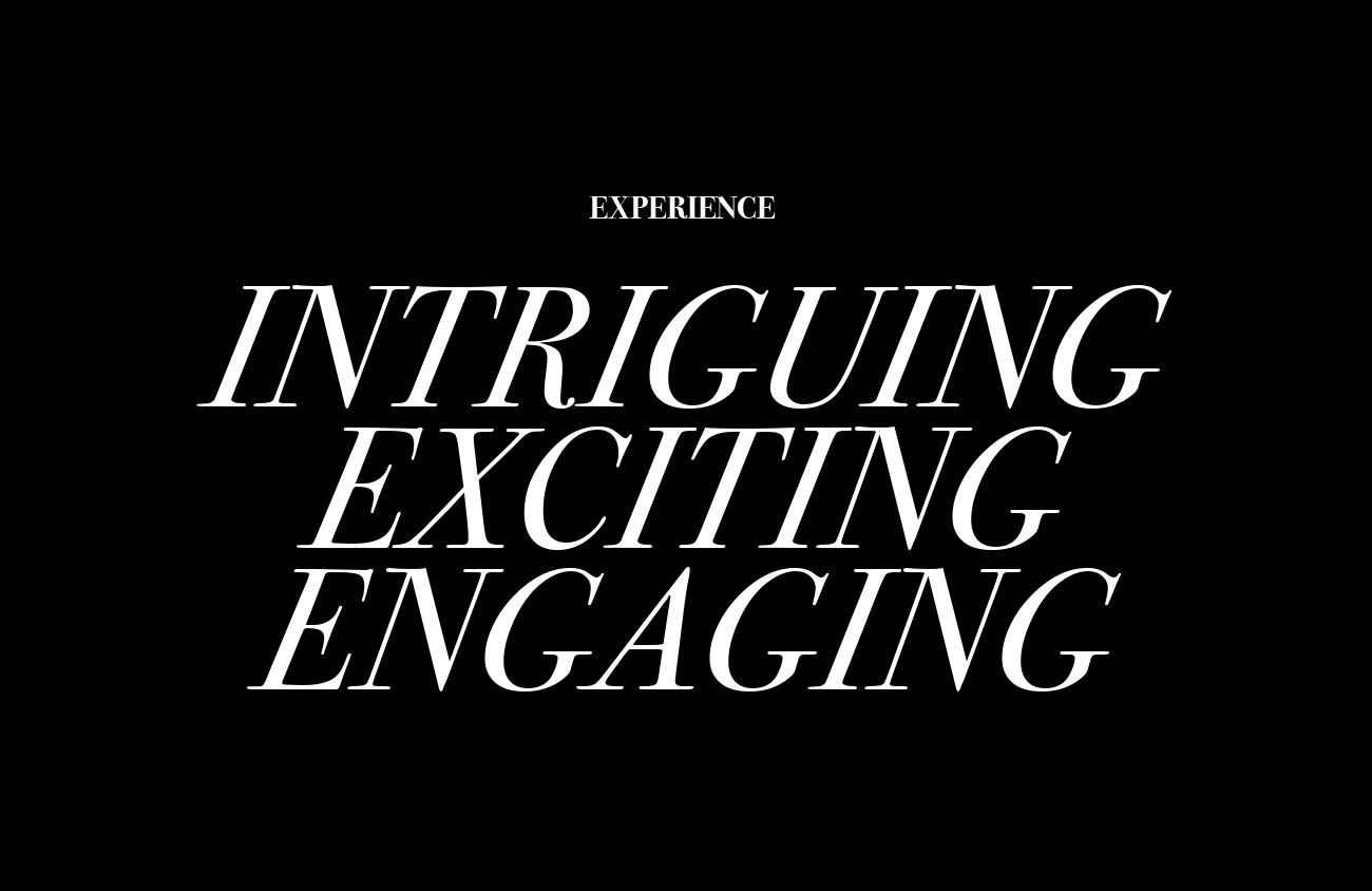
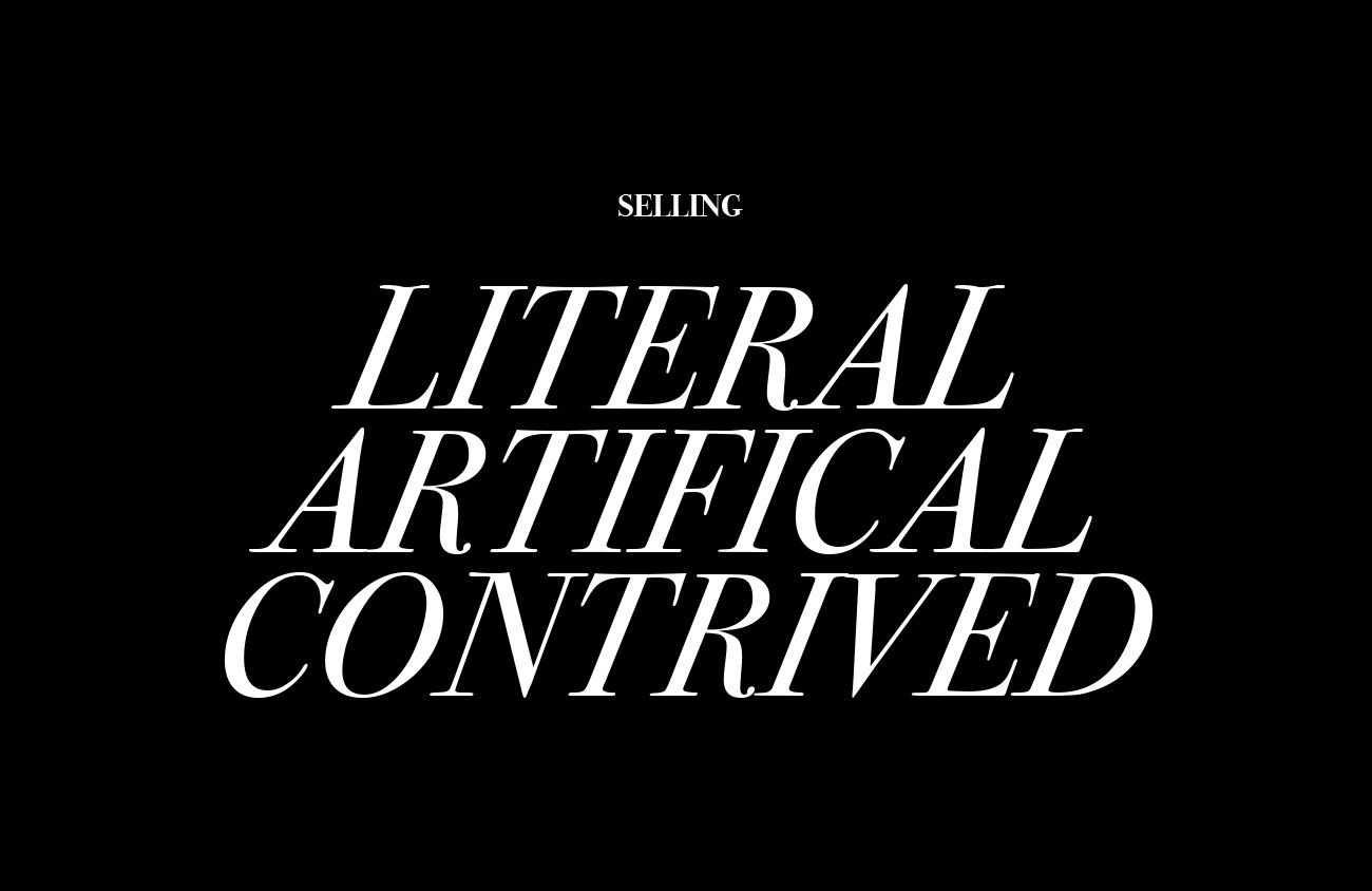
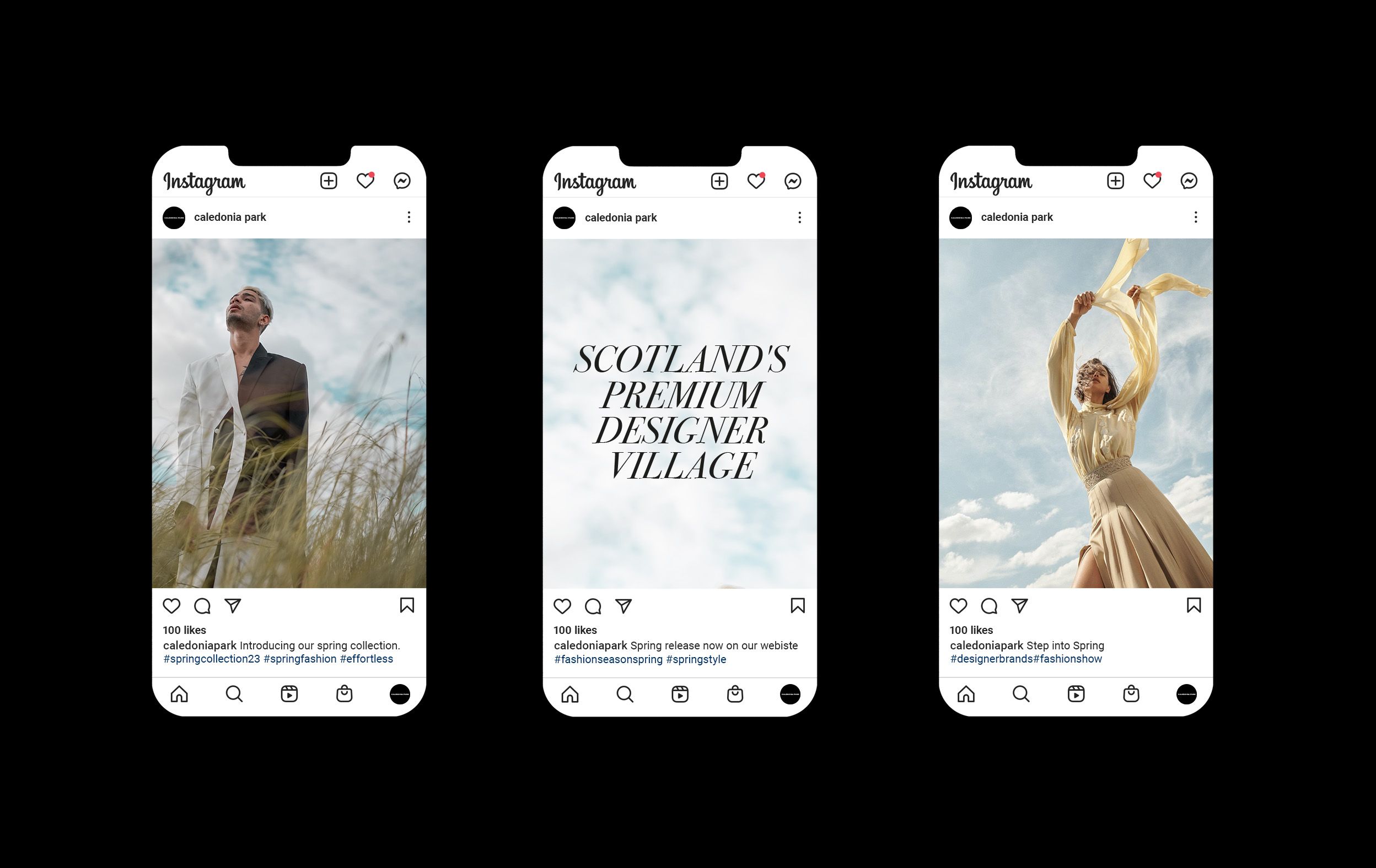
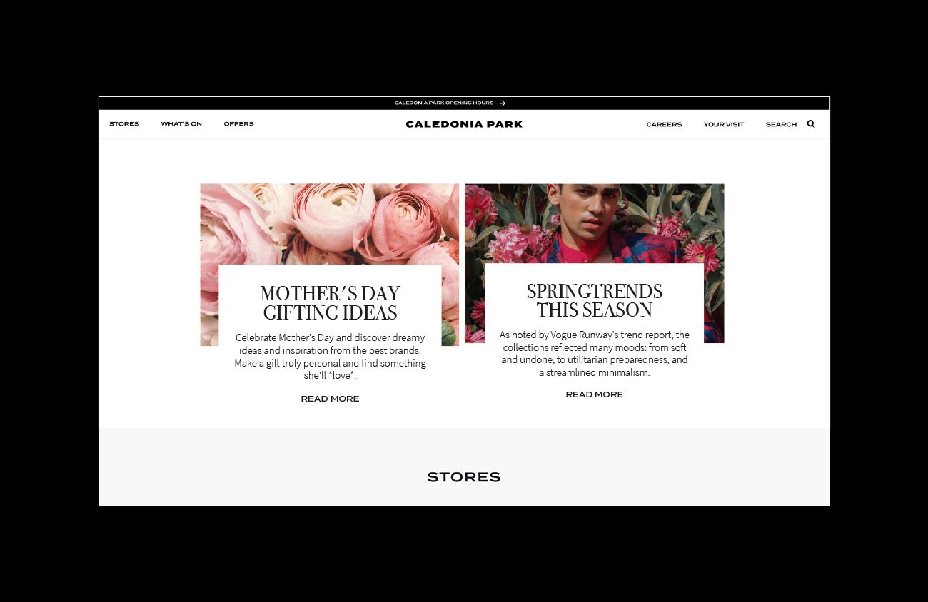
We identified a noticeable truth: much of the fashion outlet world doesn’t look fashionable. Therefore, our work with cp focused on developing an ownable aesthetic; giving it a greater attitude and maximising its location became key. The visual identity was inspired by the idea of connecting fashion and nature. The scope saw all core brand assets go through a process of transformation and visual refinement, including logotypes, graphic attitude, packaging, art direction and photography. We adopted a more editorial tone to make it accessible but without losing any of the authoritative voice that is critical to the consideration of new brands. The result is a brand that is progressive, creative and authentic. Stepping away from contrived artificial selling, to embracing experiences with a new attitude and spirit.
