The Client
Celtic Bakers
Brand strategy + identity + packaging + signage
Artisan Bakers
365 Days A Year
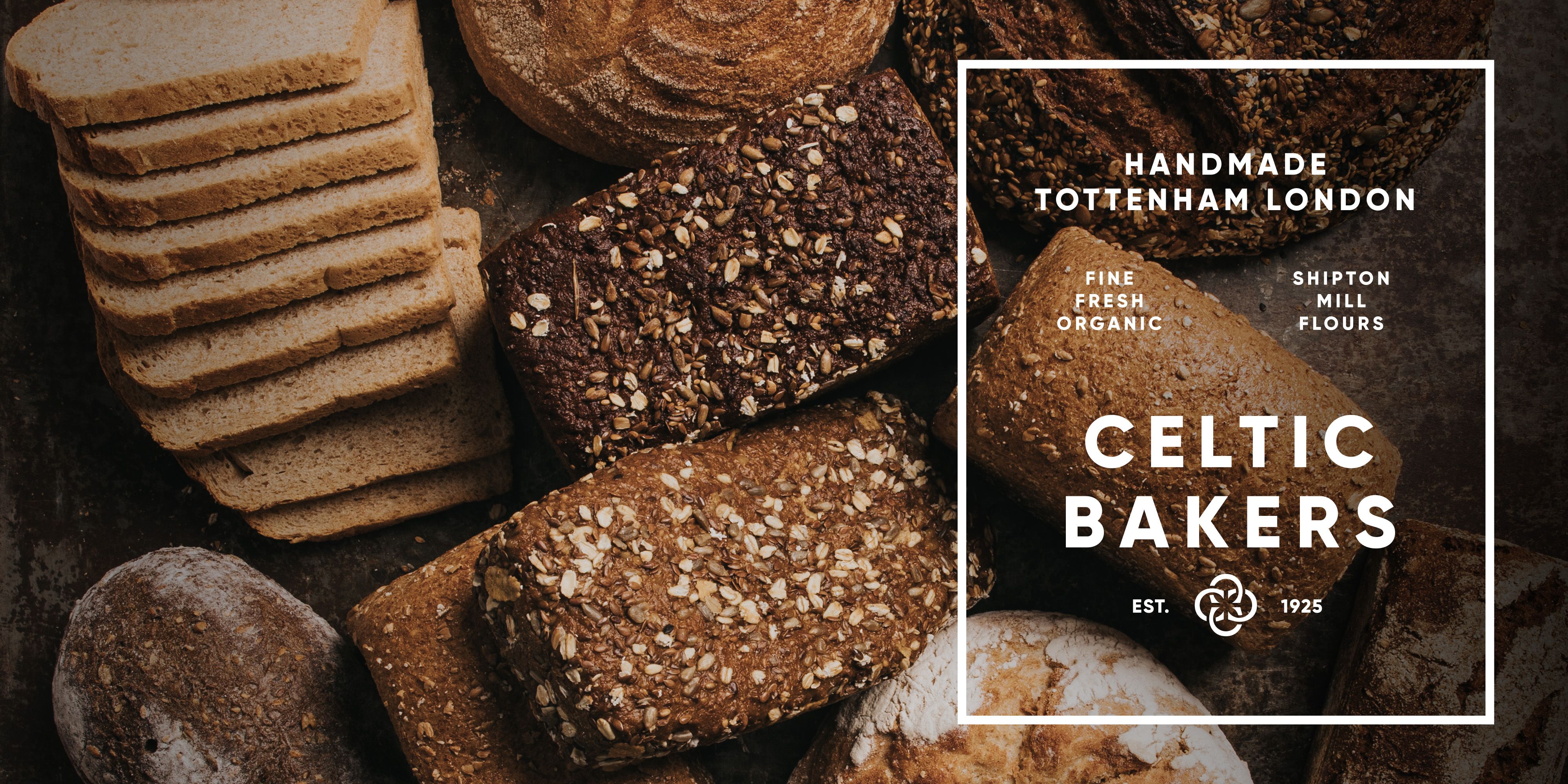
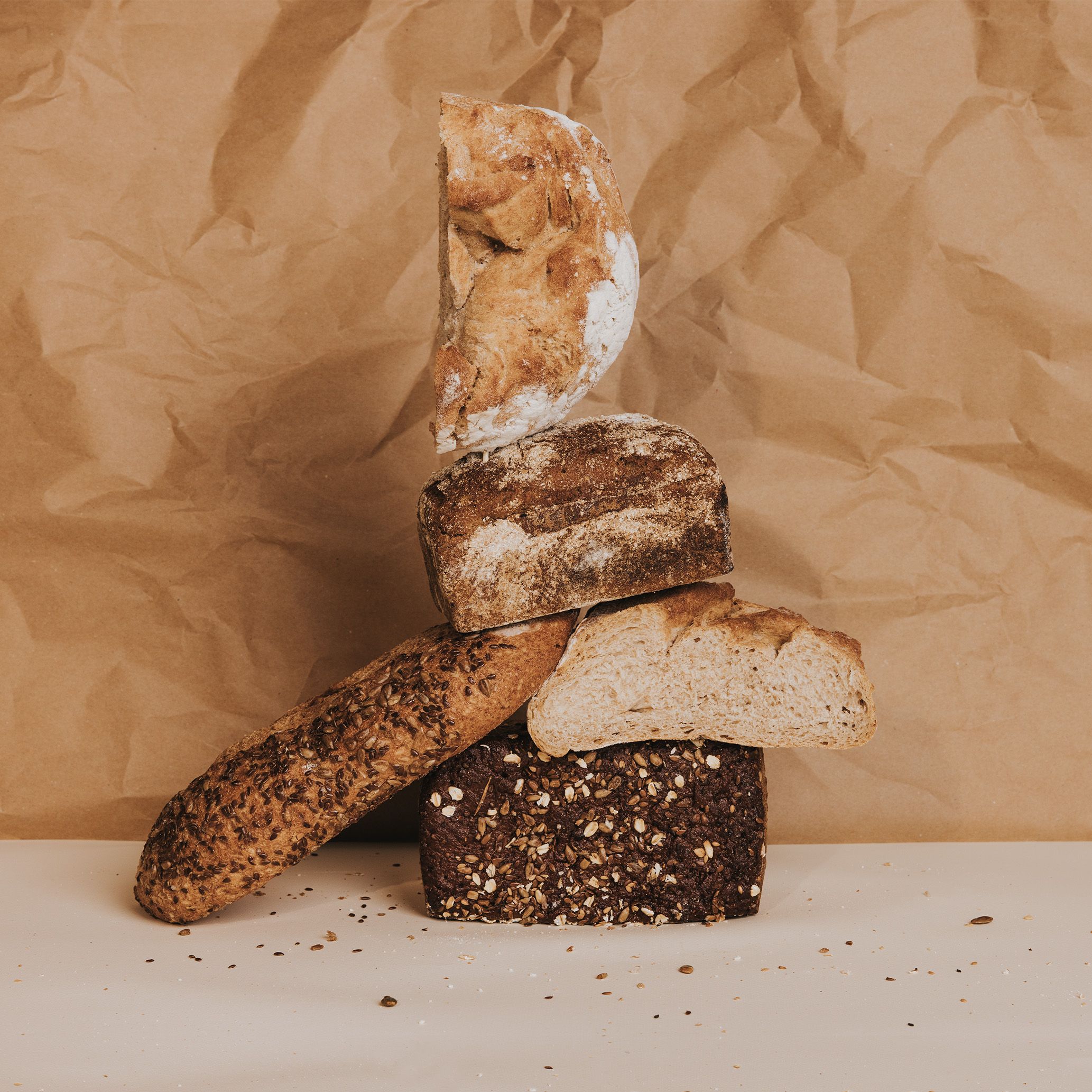
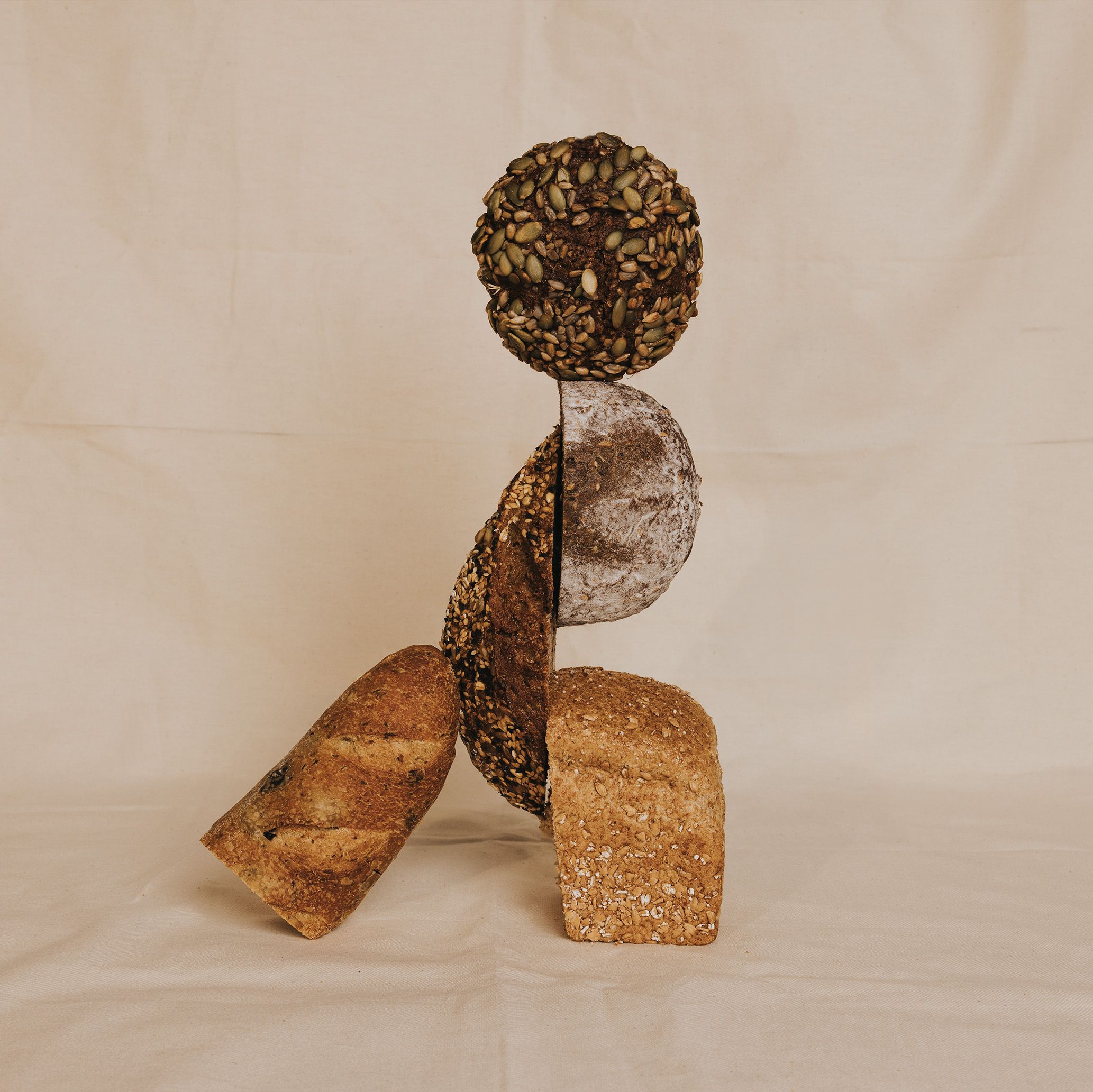
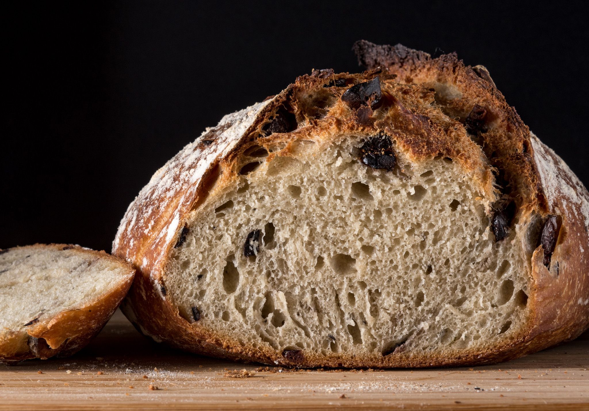
Artisan bread no longer means exclusive audiences and unattainable price points. Uk brand celtic bakers brings organic baked goods available to the many, not the few. Producing lovingly hand-crafter cakes, patisseries and sourdoughs in their state-of-the-art tottenham warehouse, celtic bakers wanted a new brand expression that communicated the essence of their products - authentic and honest - whilst educating their audience in a way that is both inspiring, informative and real.
Organic
means everything to us
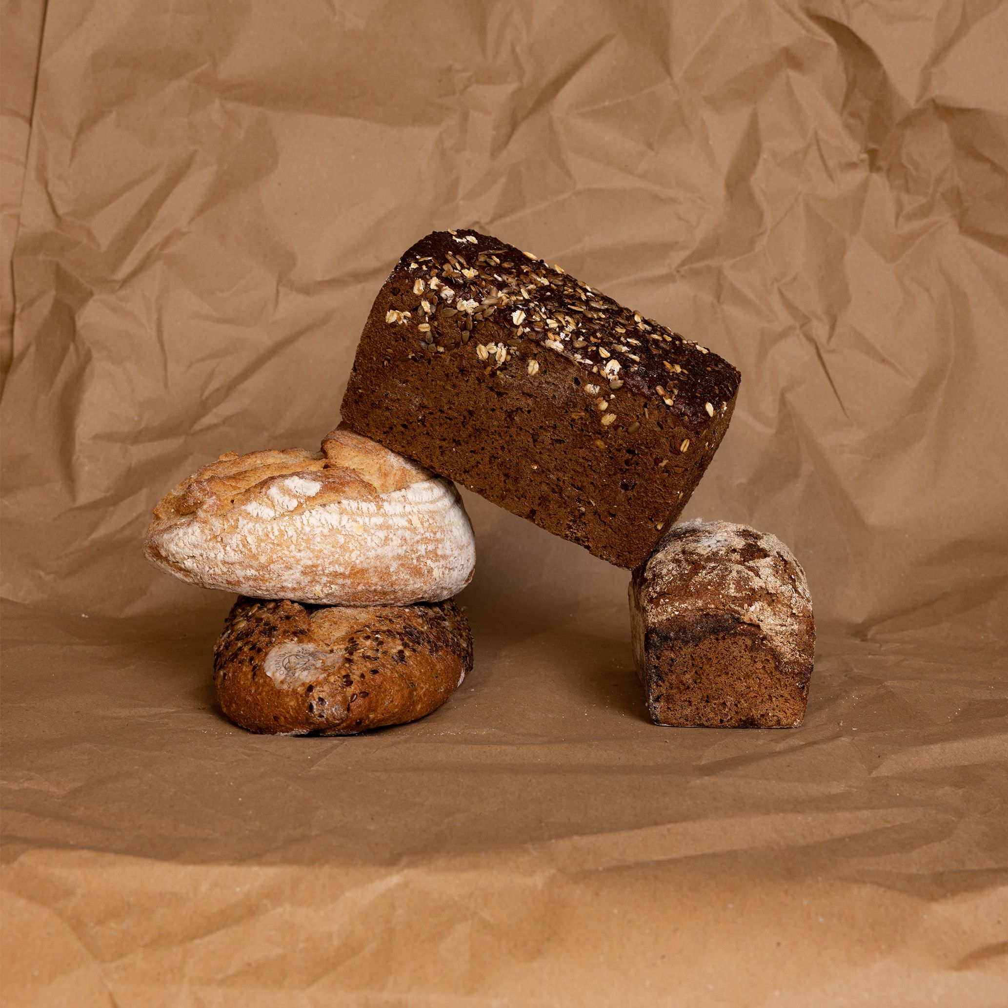
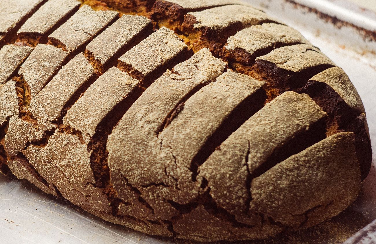
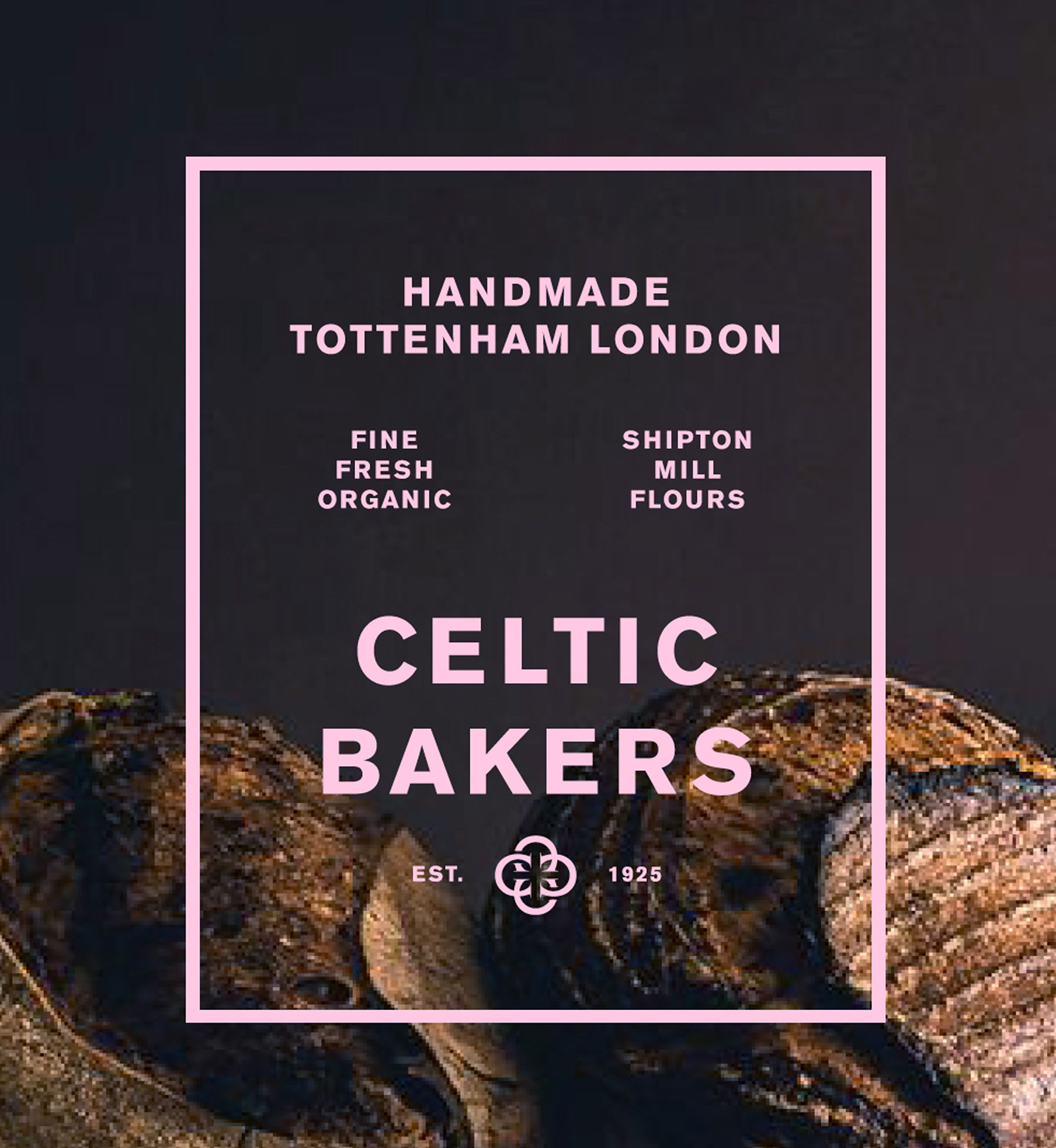
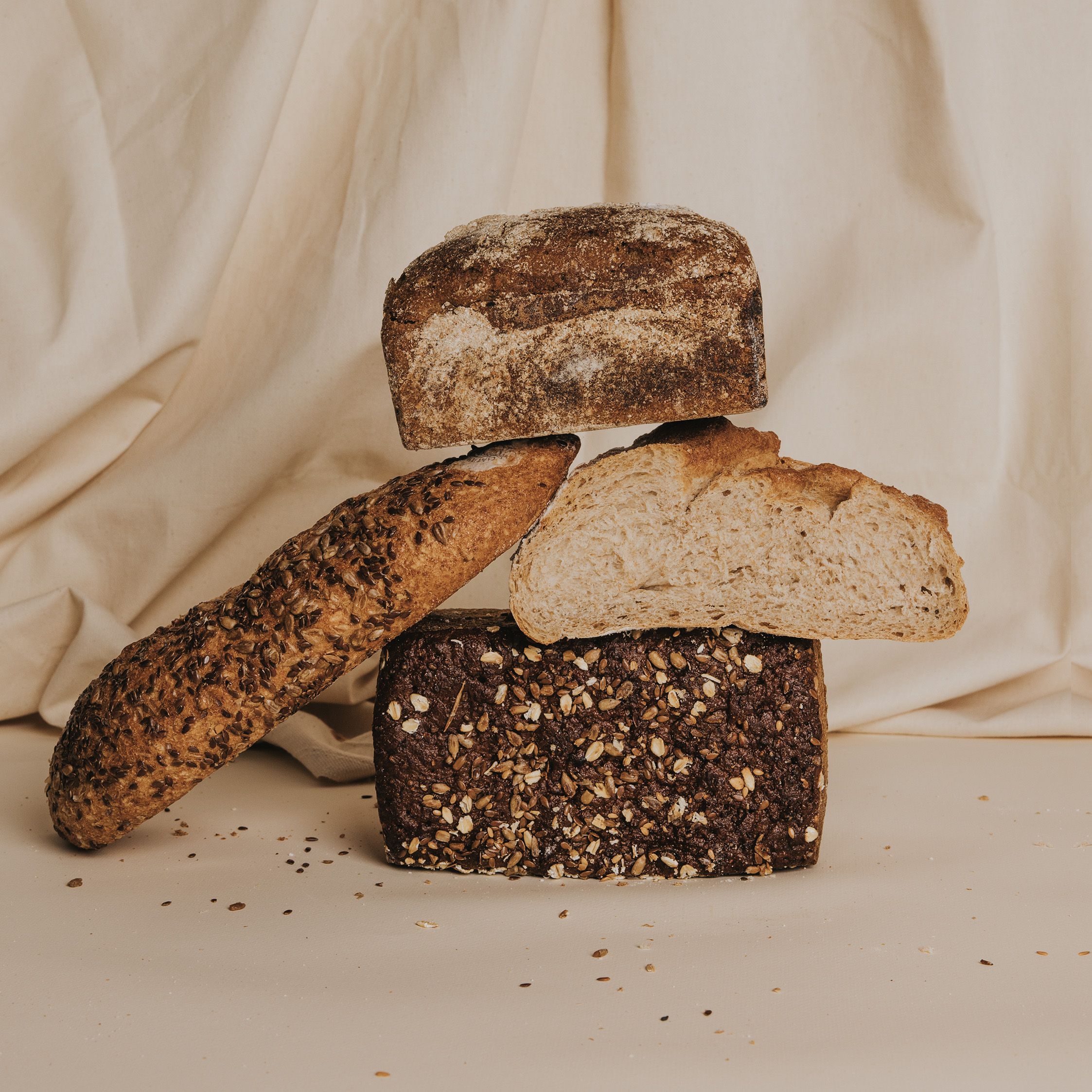
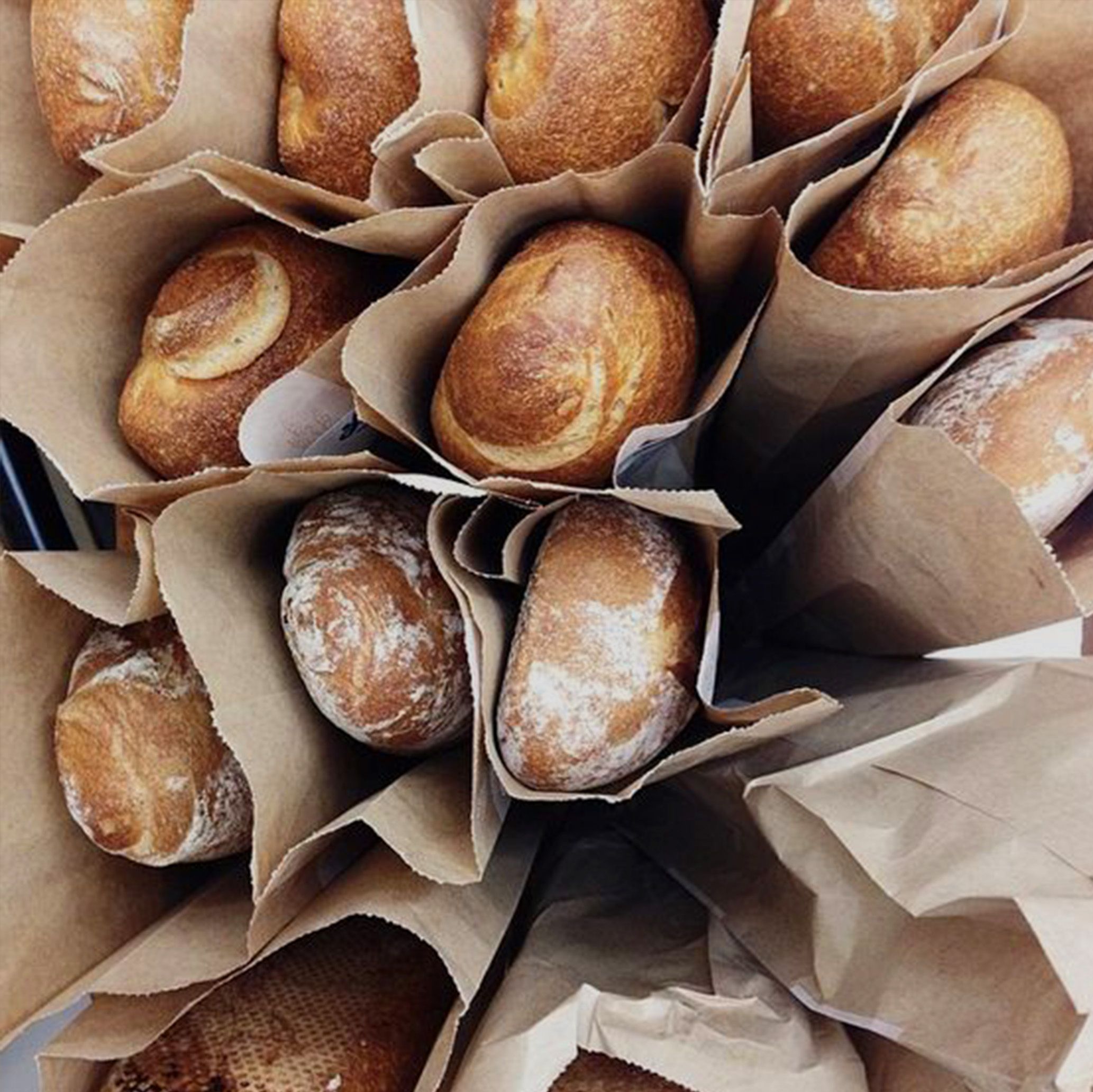
Celtic Bakers celebrate and respect the traditions of bakery, where time, ingredients and methodology are everything. Gone are the days when ‘organic’ equals bland homogeneity. Celtic Bakers pride themselves on the quality of their ingredients and are proud to be working with the UK’s leading organic flour mill - Shipton Mill.
Respecting Baking Traditions
where time, ingredients and methodology
are everything.
are everything.
The Integrity
Of Craftmanship
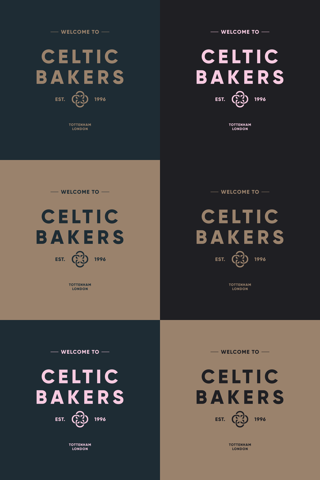
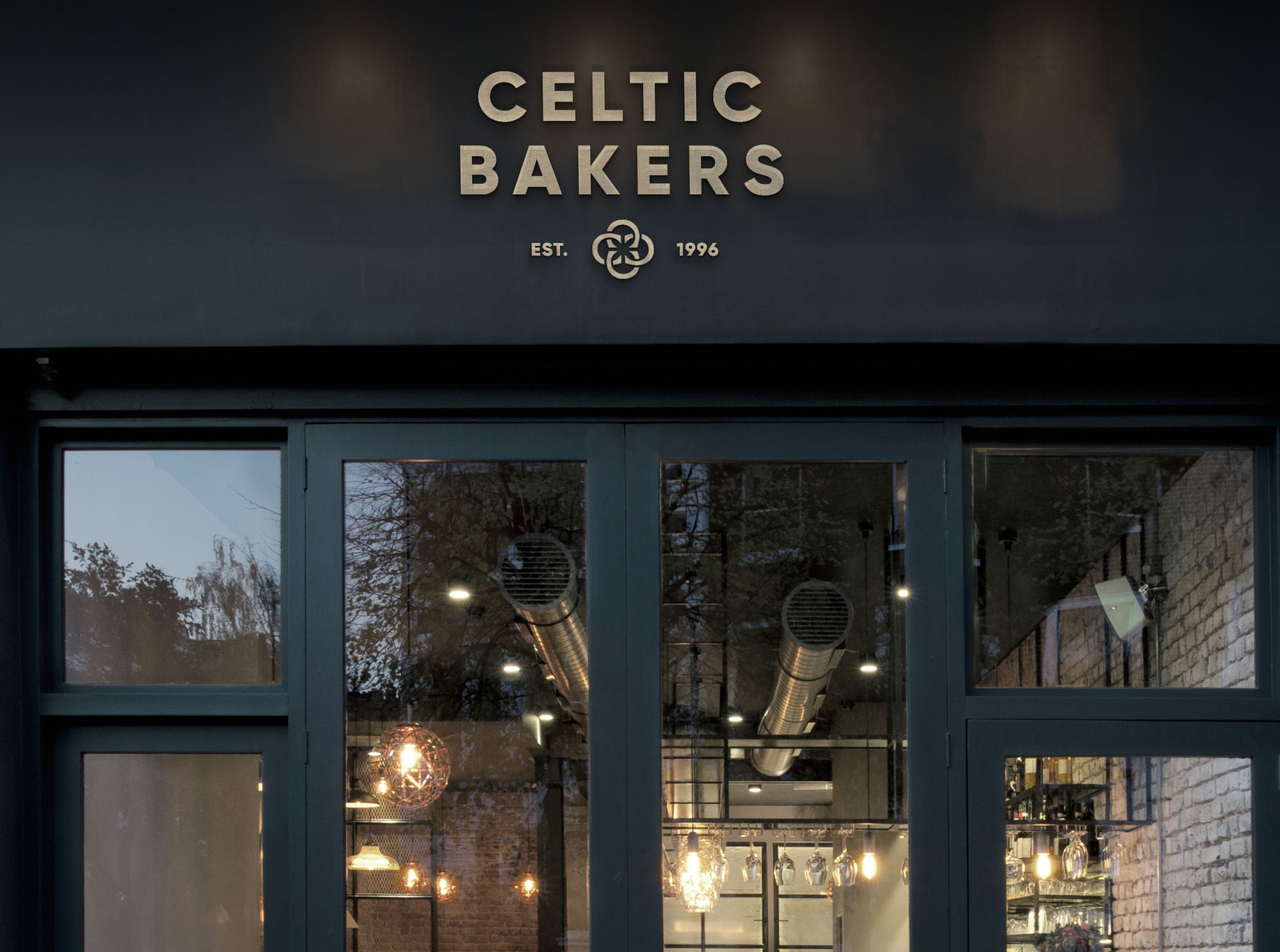
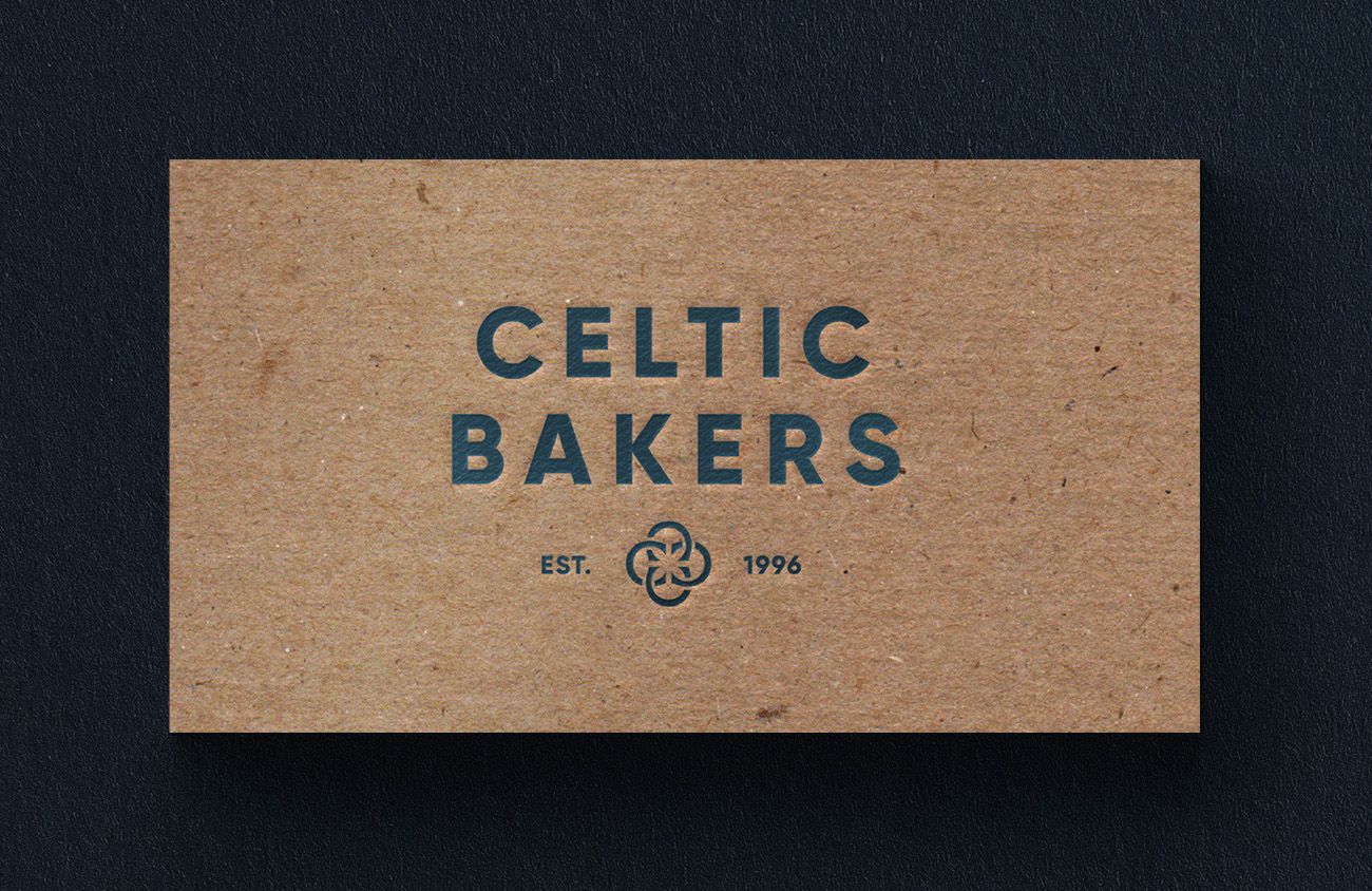
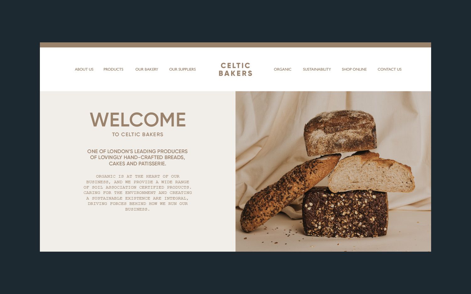
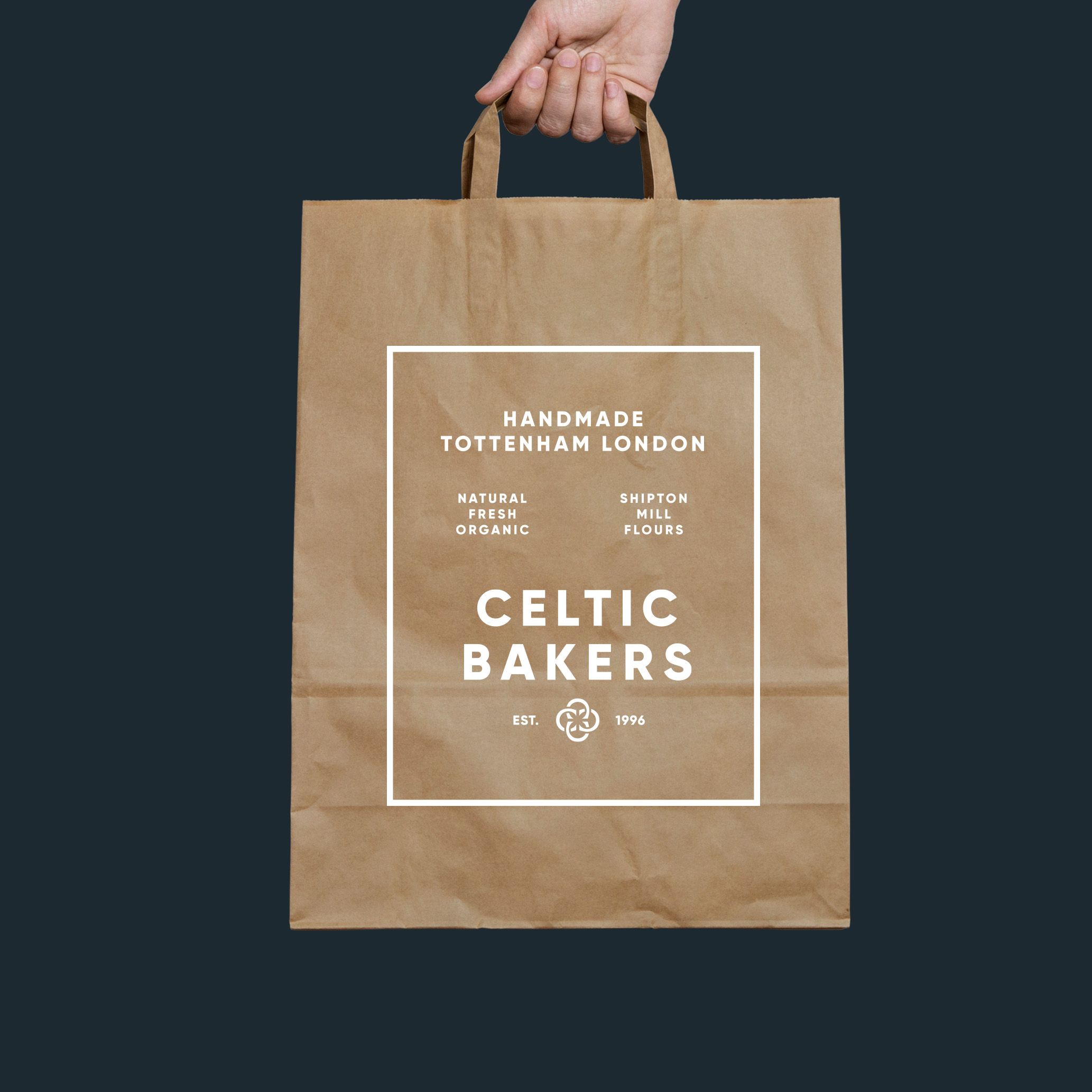
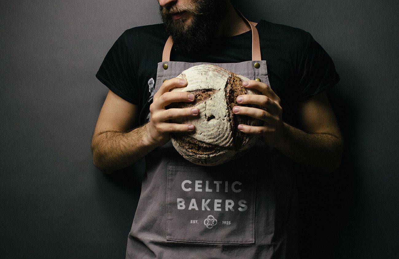
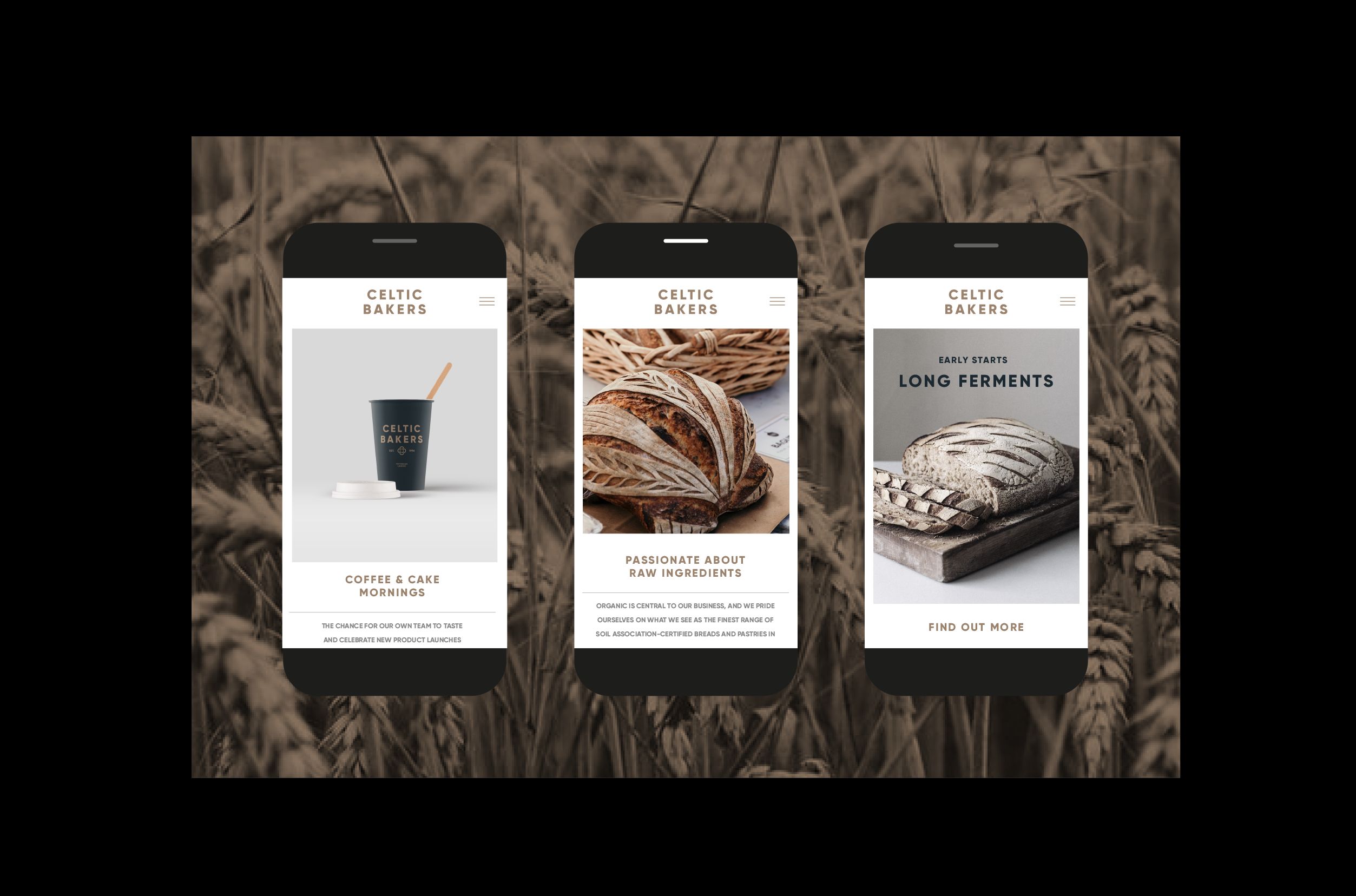
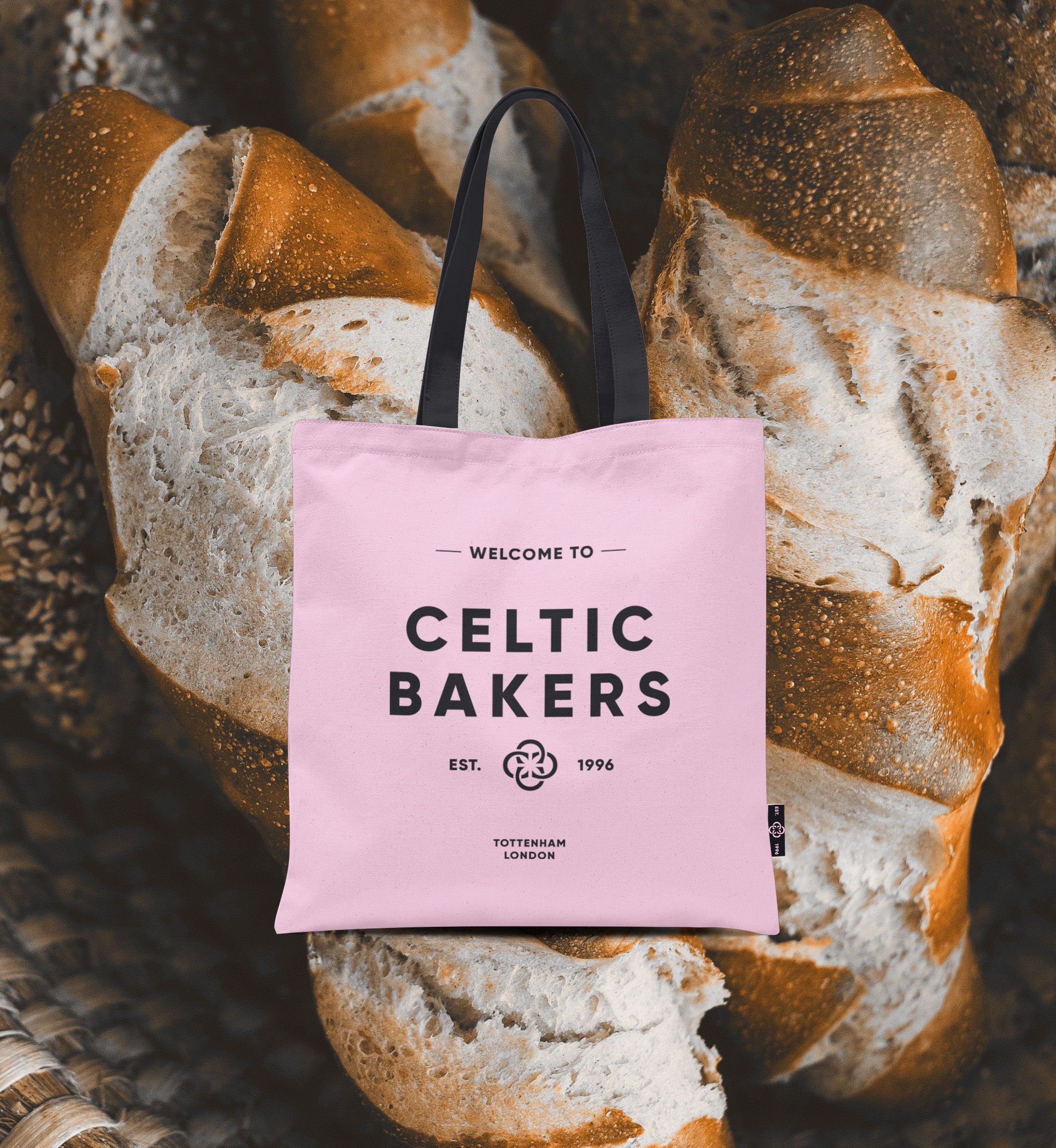
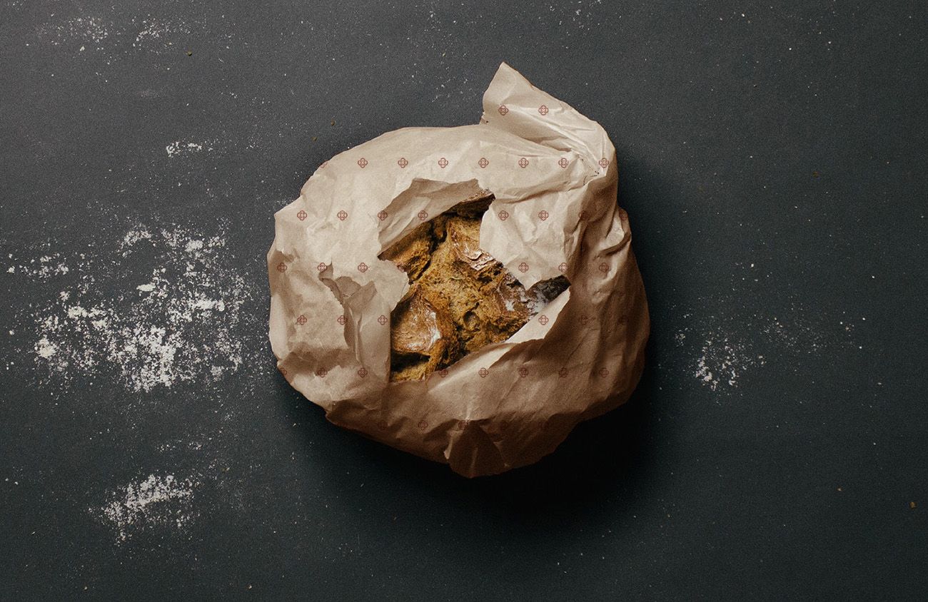
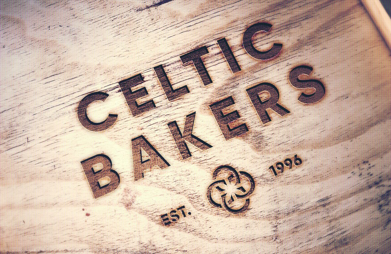
We worked closely with the team to refresh the way the brand appeared and behaved in the baking sphere. We refreshed their identity, celebrating the craft, history, and ingredients of baking, creating a new standard for their art direction and overall brand expression across their packaging, website and signage. We designed a wordmark that leverages the industrial heritage of bread making and crafted a bold extended sans serif type treatment, paired with an monogram of linked c’s which connect to create negative space - expressing the grains of wheat used in their produce. The color palette reflects a raw industrial style, with an added unexpected hit of pink for a modern and striking effect taking celtic bakers’ into a vibrant new chapter of growth.
