The Client
La Fleur De Chocolat
Brand strategy + identity + packaging + art direction
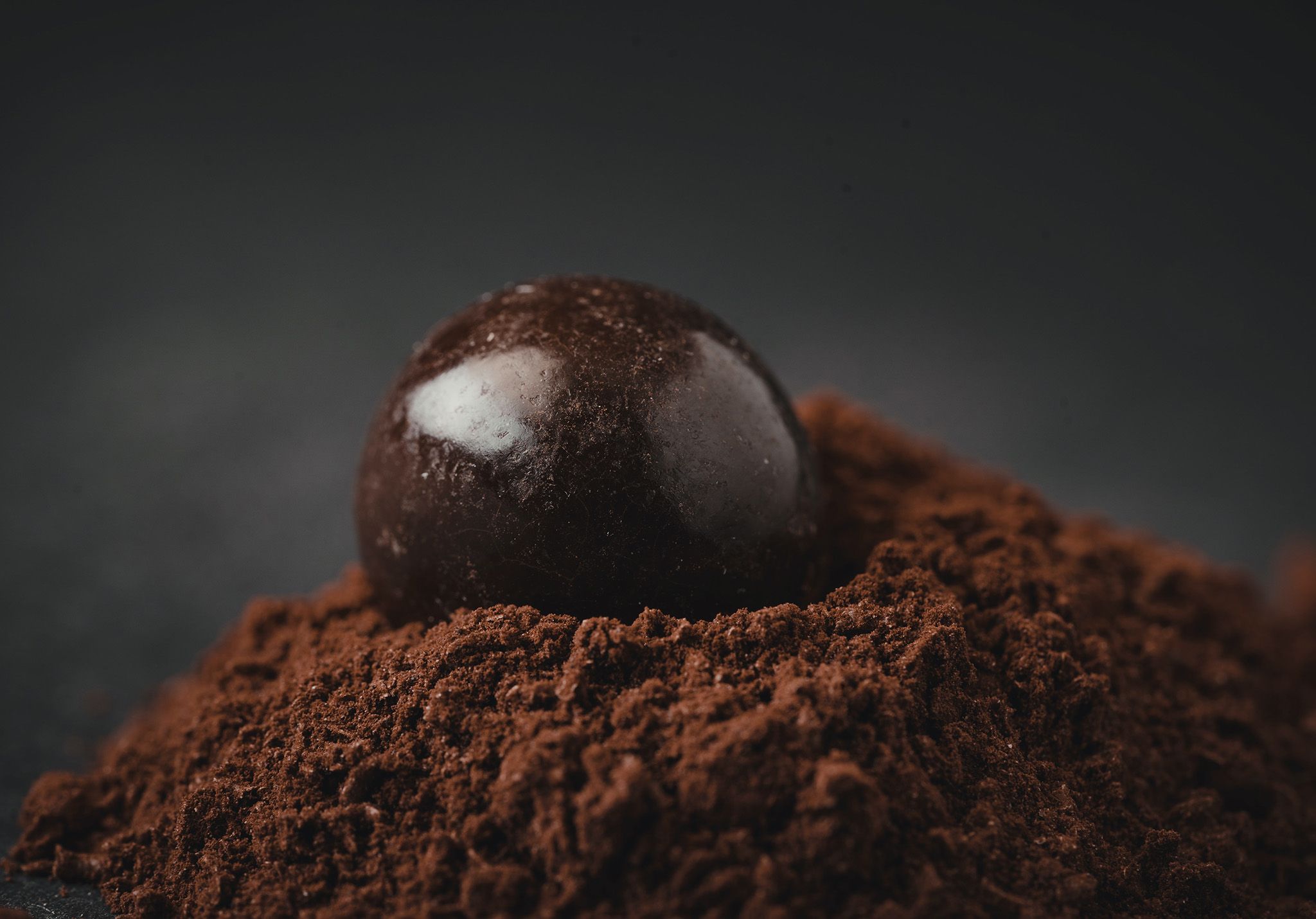
Handcrafted
Artisan Chocolates
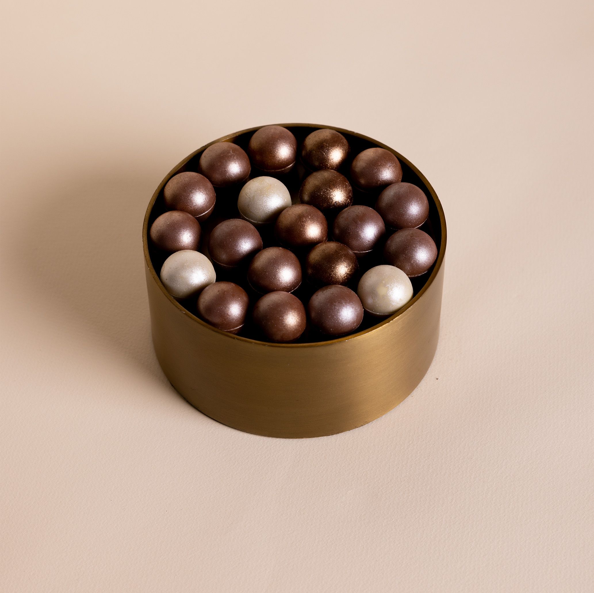
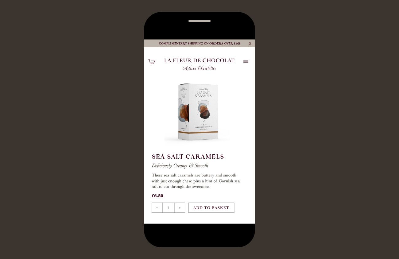
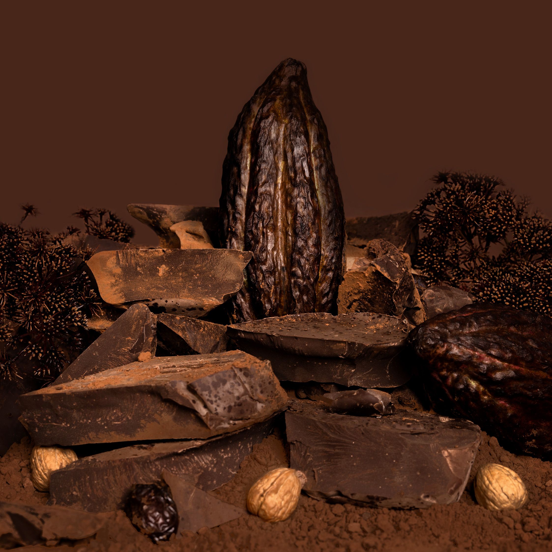
Fleur's founder has been producing exquisite chocolates since launching La Fleur De Chocolat in 2014. With numerous taste awards under her belt and having worked at the desserts section in Michelin-star restaurants, we rightly positioned La Fleur de Chocolate as an artisan chocolatier who not only hand makes sensational chocolate, but simultaneously promotes positive change for small cocoa farmers. And in that process educates consumers about the origins of the bean, and its transformation to bar. We created a new brand identity that would modernise the business and better communicate Fleur's core proposition and personality to trade and retail customers.
Quality
over quantity
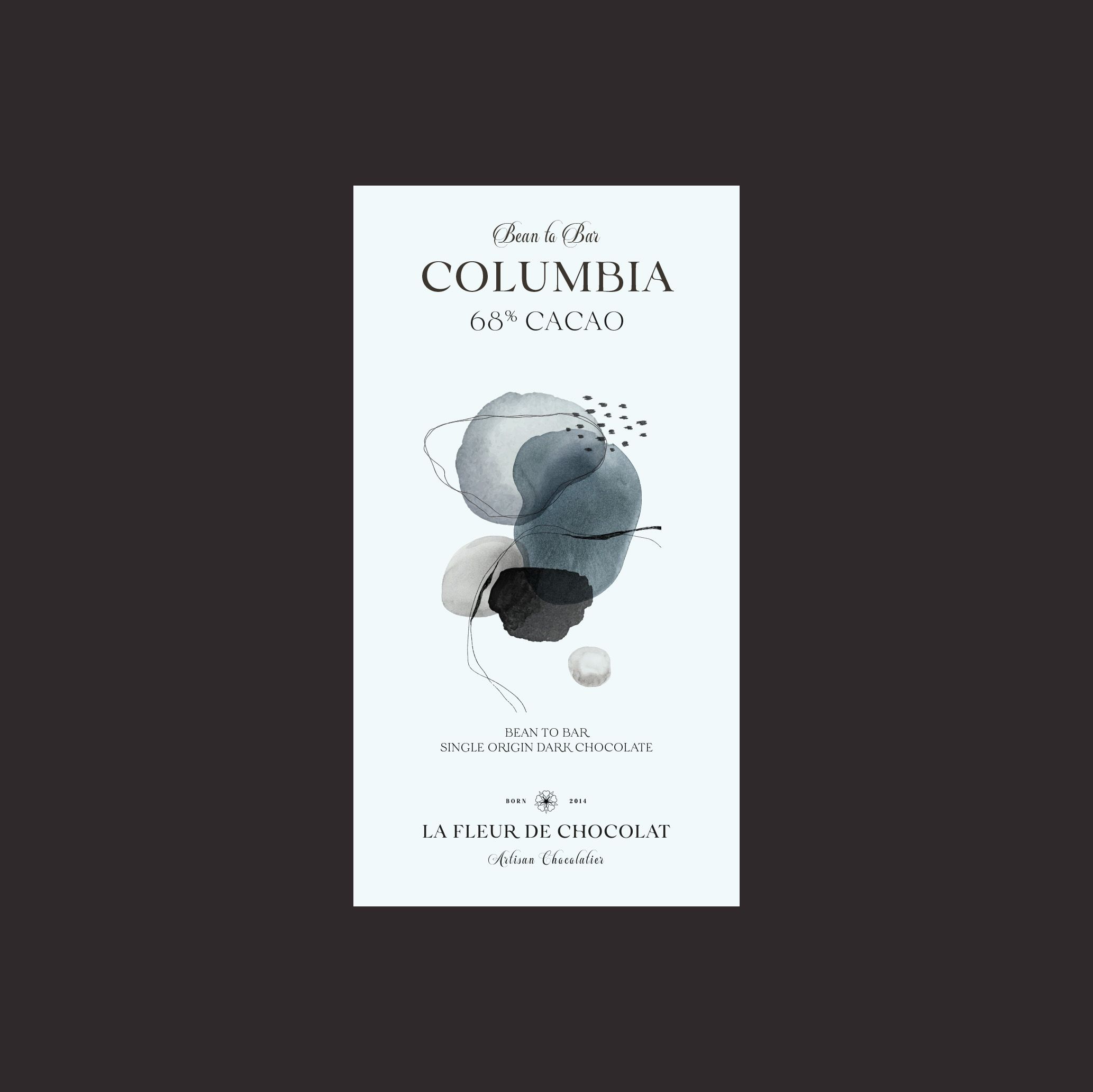
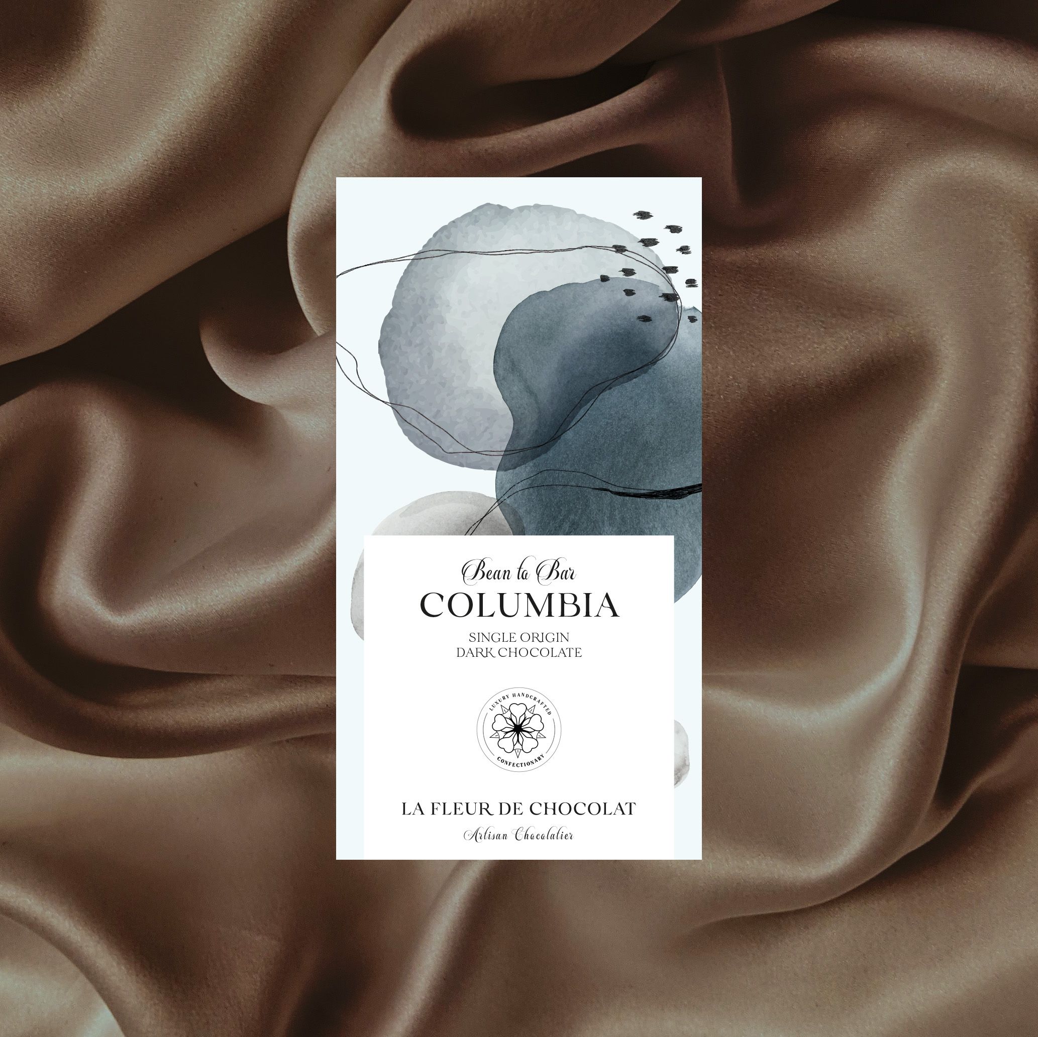
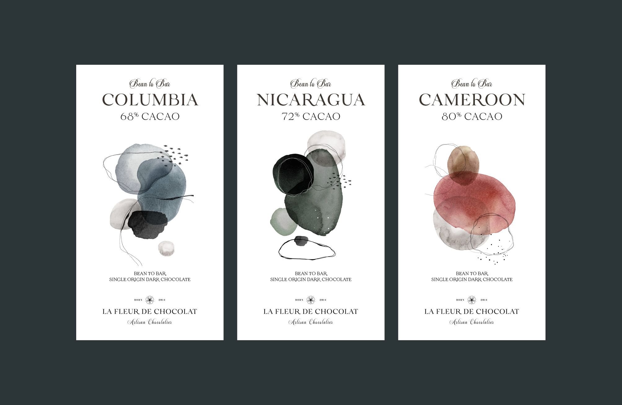
Standing out on the shelves has become paramount, an essential part of getting the product noticed, and recent trends have seen louder, brighter, larger patterns and embellishment than ever before. By paring down the essence of the brand we created a visual language that reflects its values with a focus on quality not quantity. This meant La Fleur De Chocolat became an antidote to the busy shelves.
Beauty
in simplicity
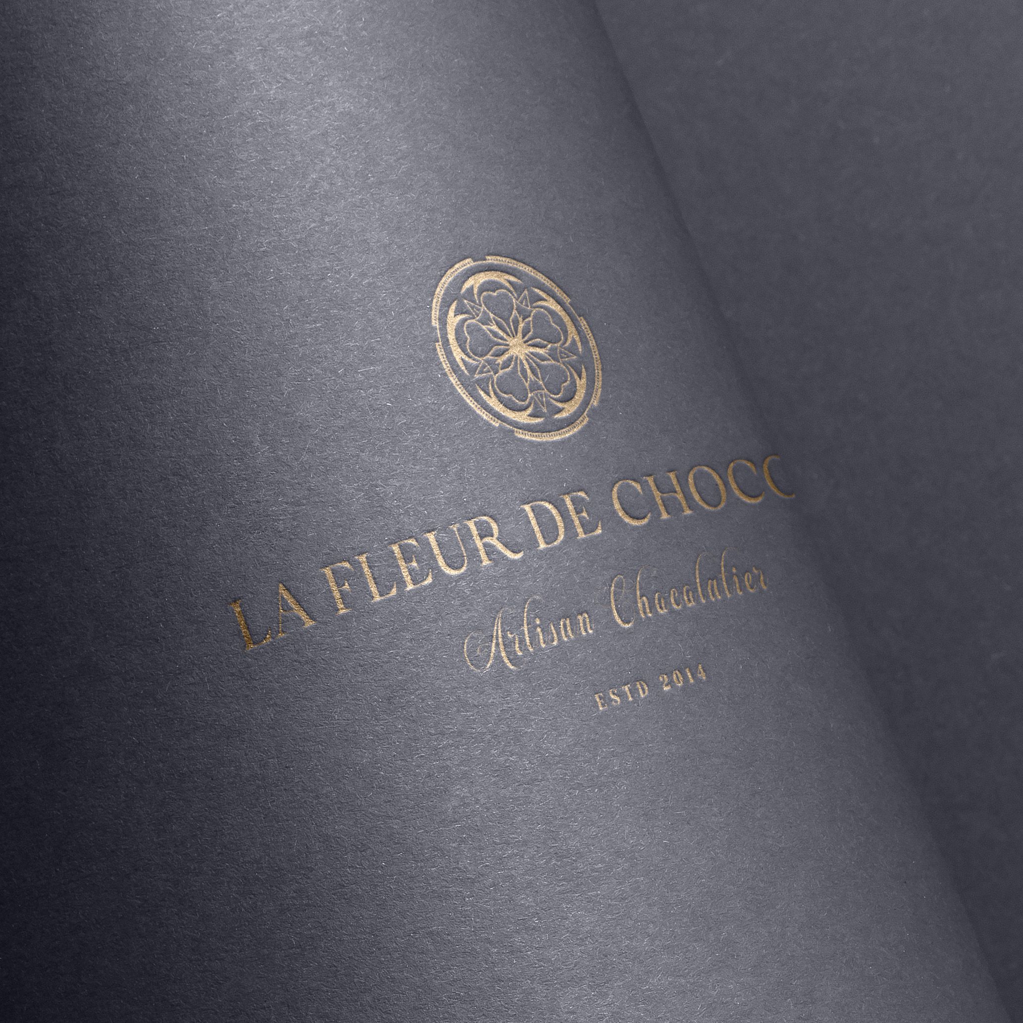
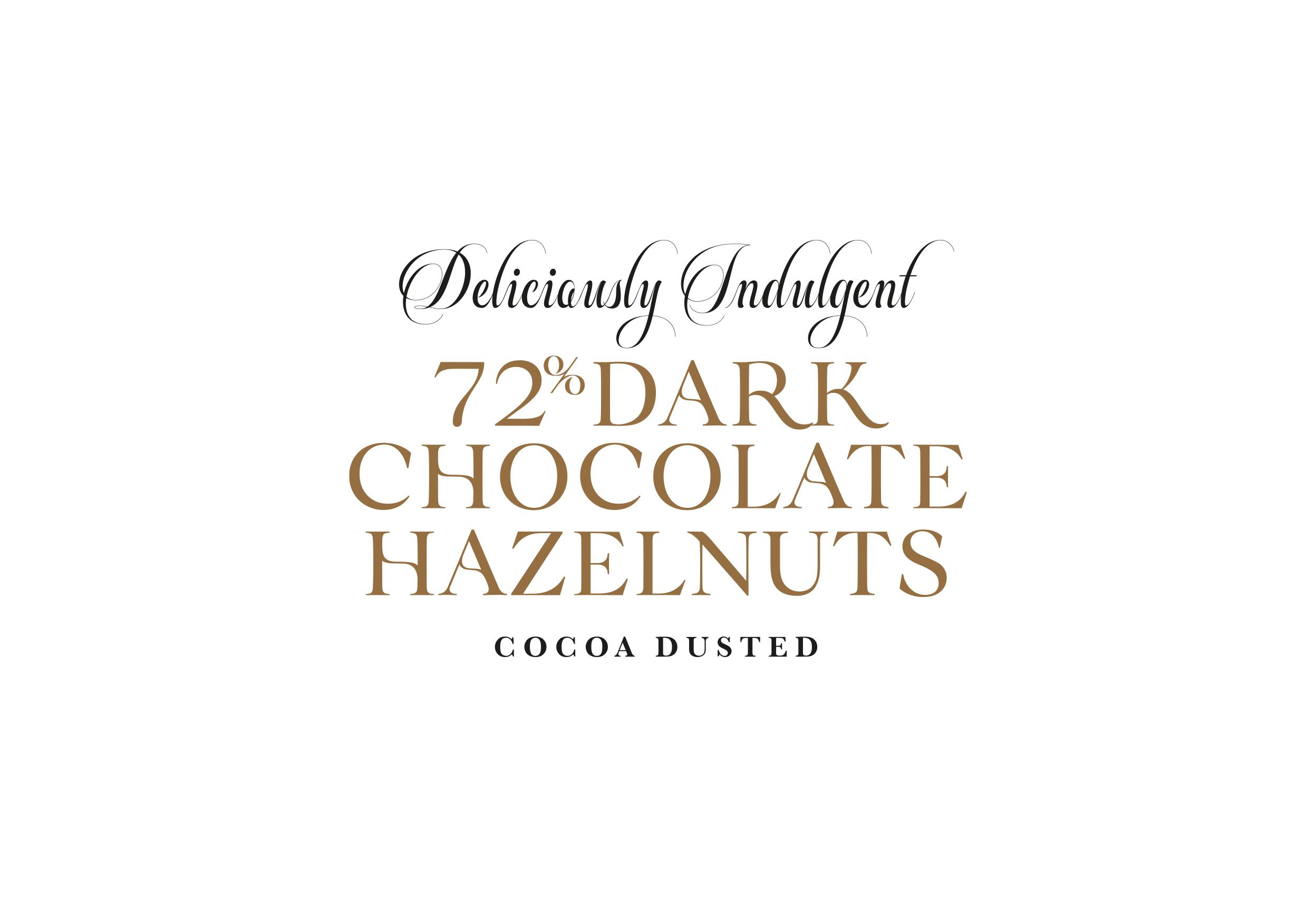
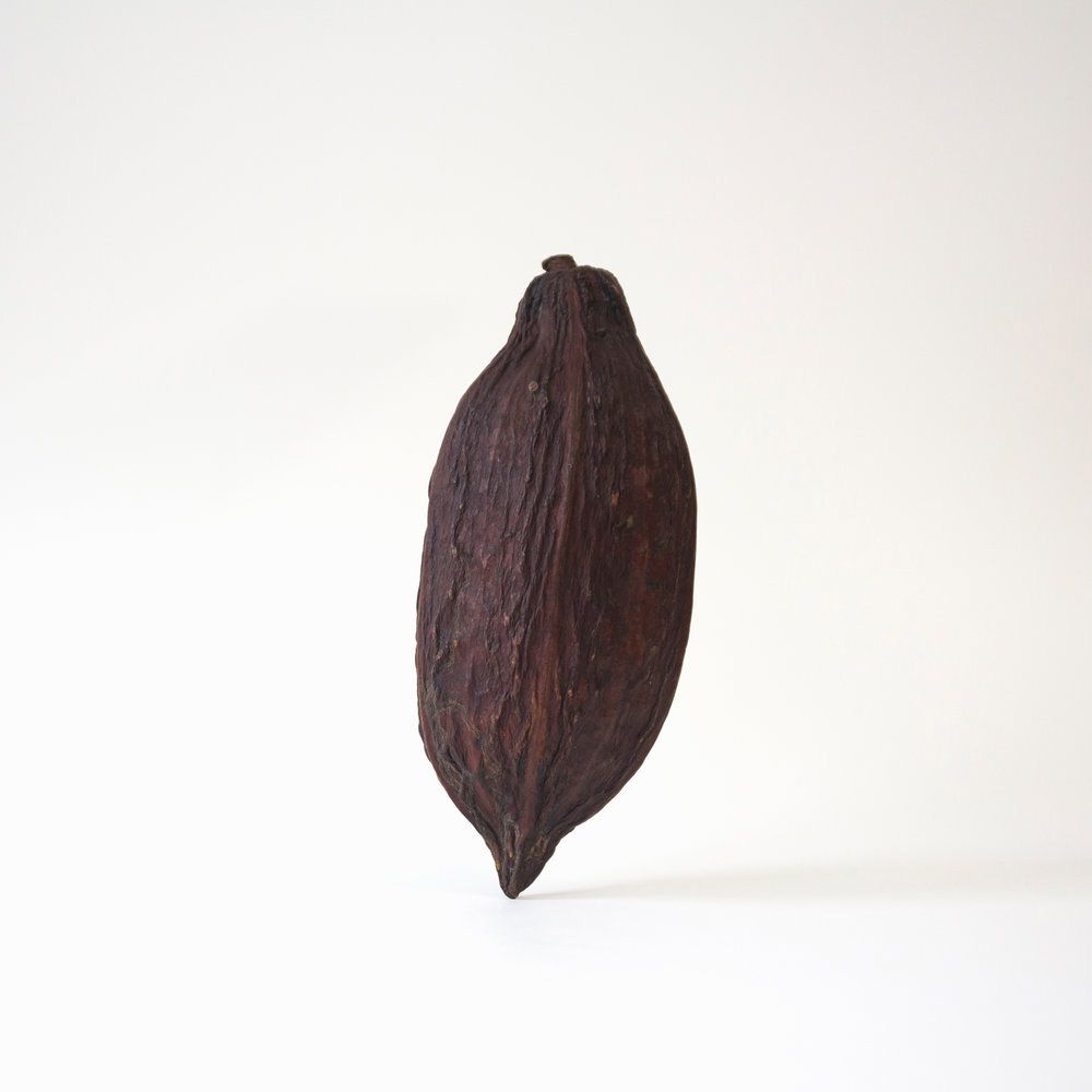
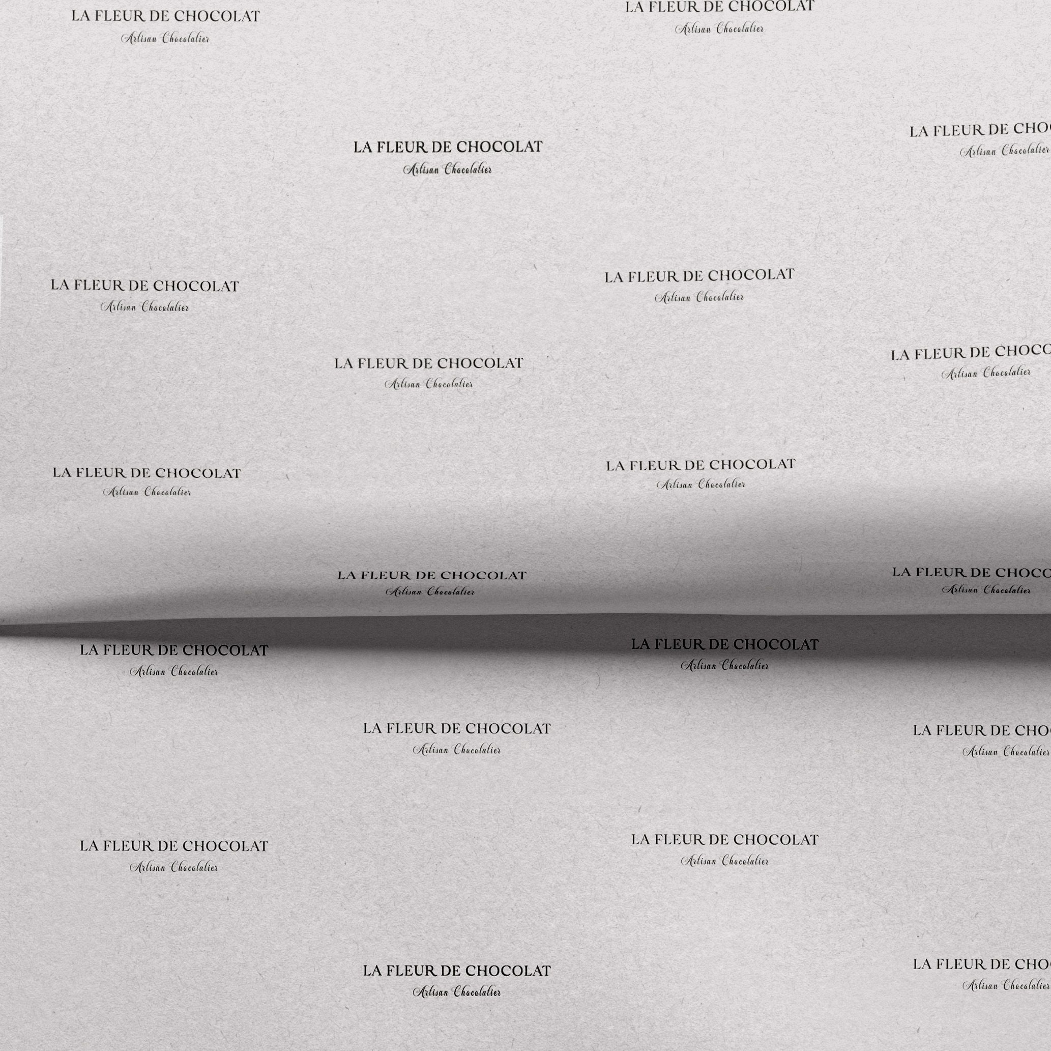
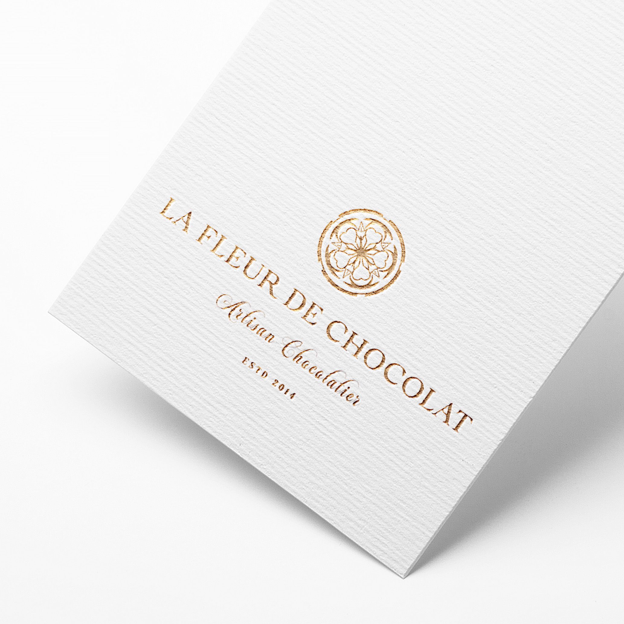
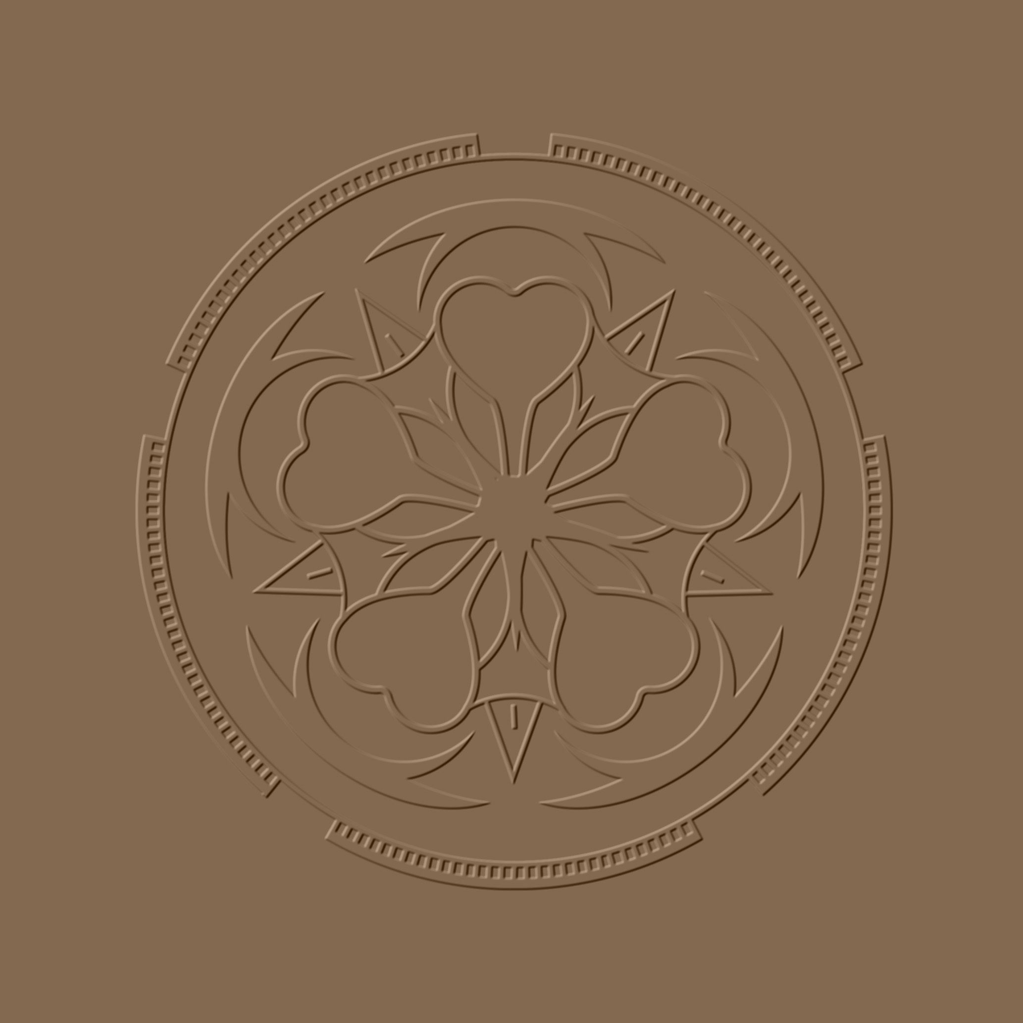
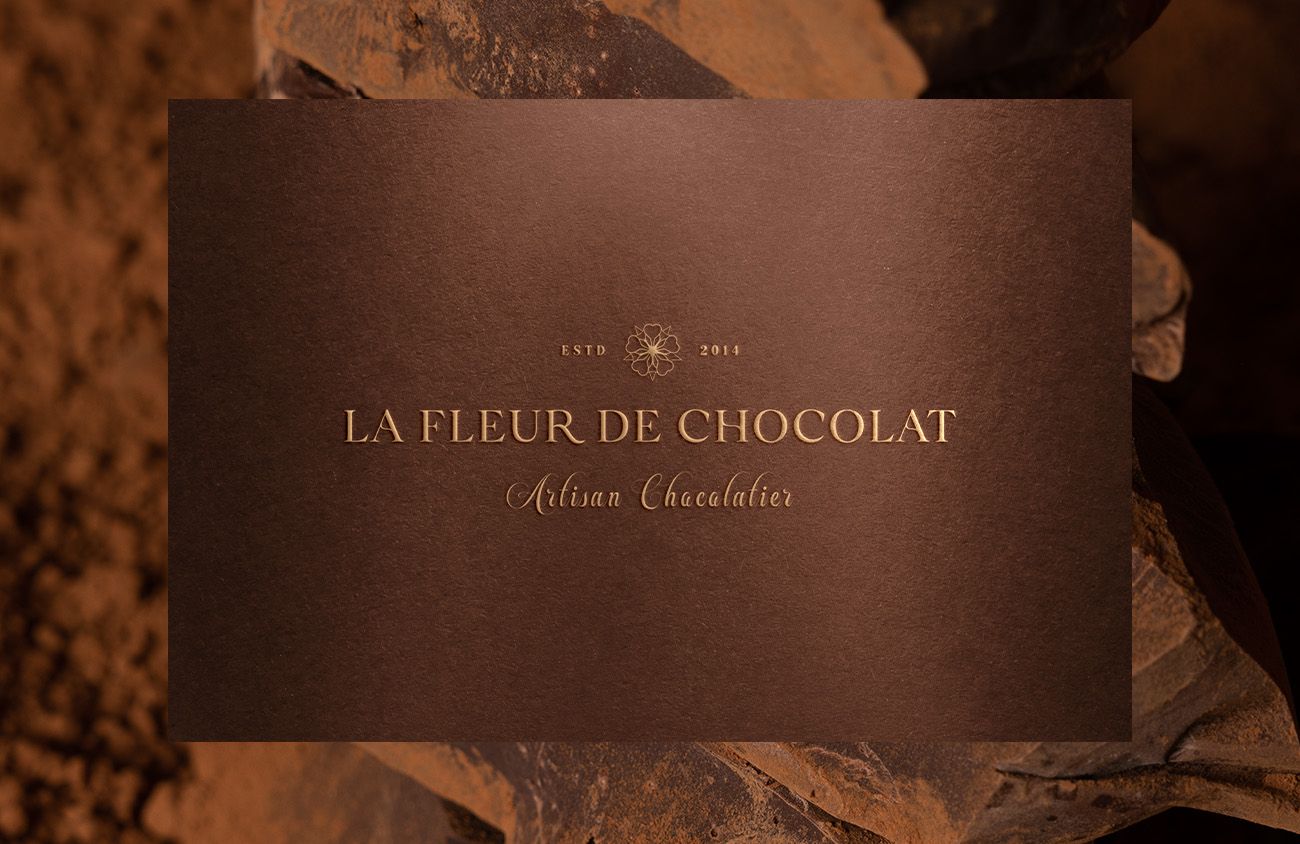
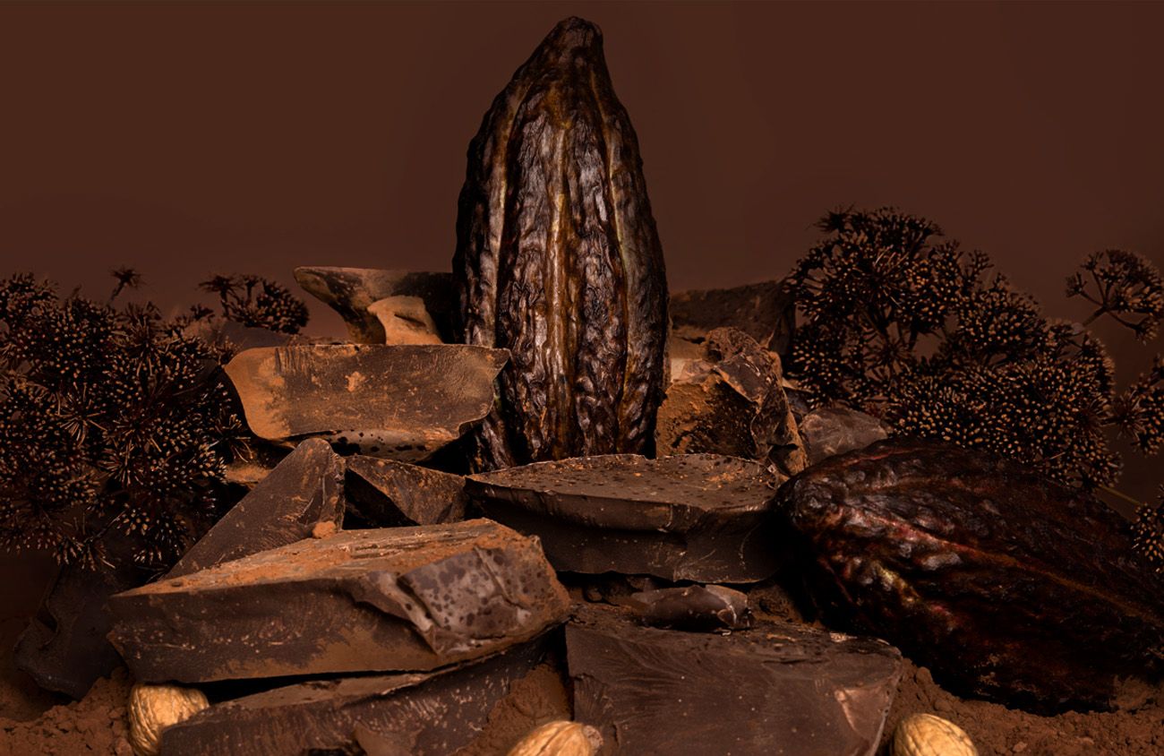
We adopted a serif and calligraphic typeface for the logo, creating a sense of fluidity similar to that of melting chocolate, whilst alluding to the finest ingredients and an element of establishment / traditionalism. The graphic marque stems from the cocoa flower and pod in its early stages of growth.
Mastering
Chocolate & Art
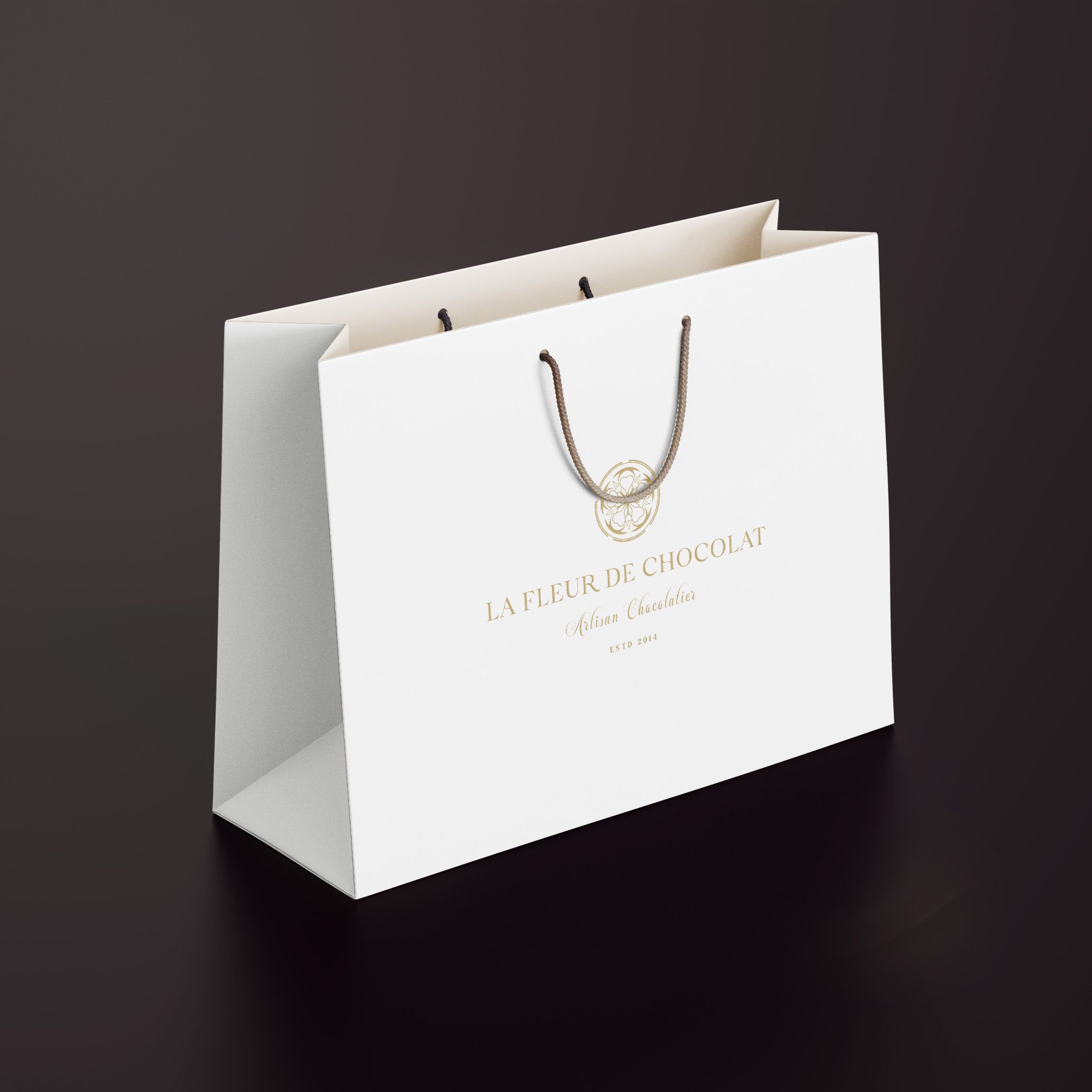
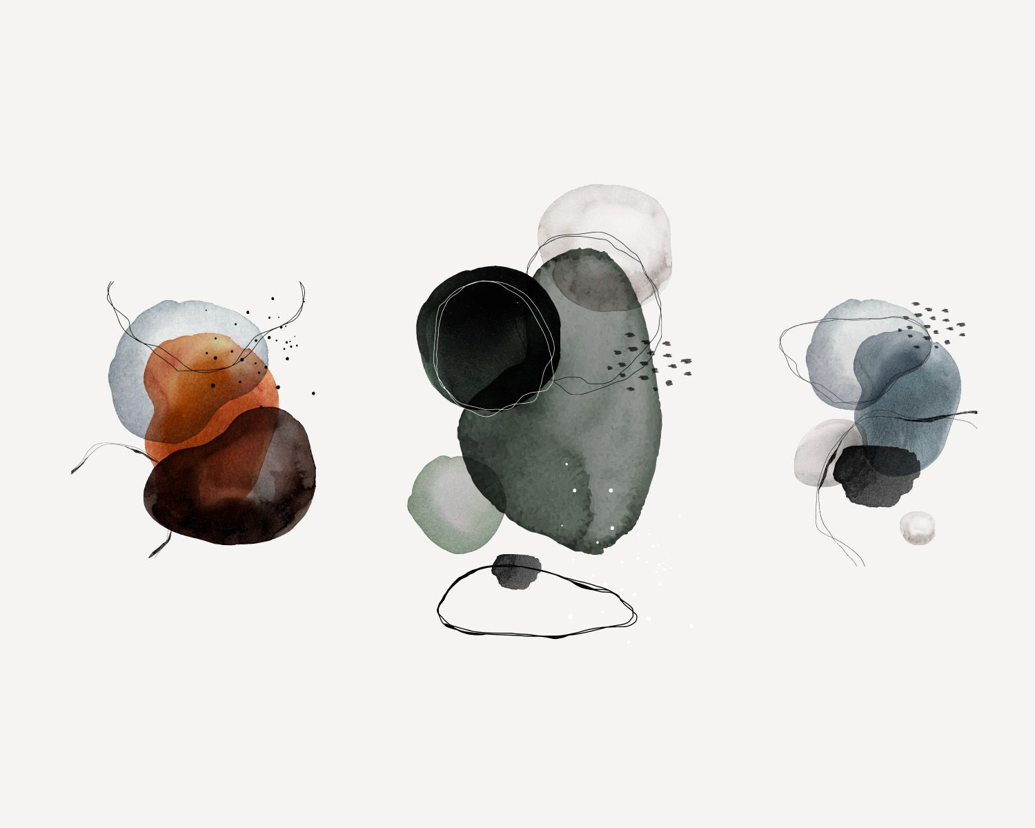
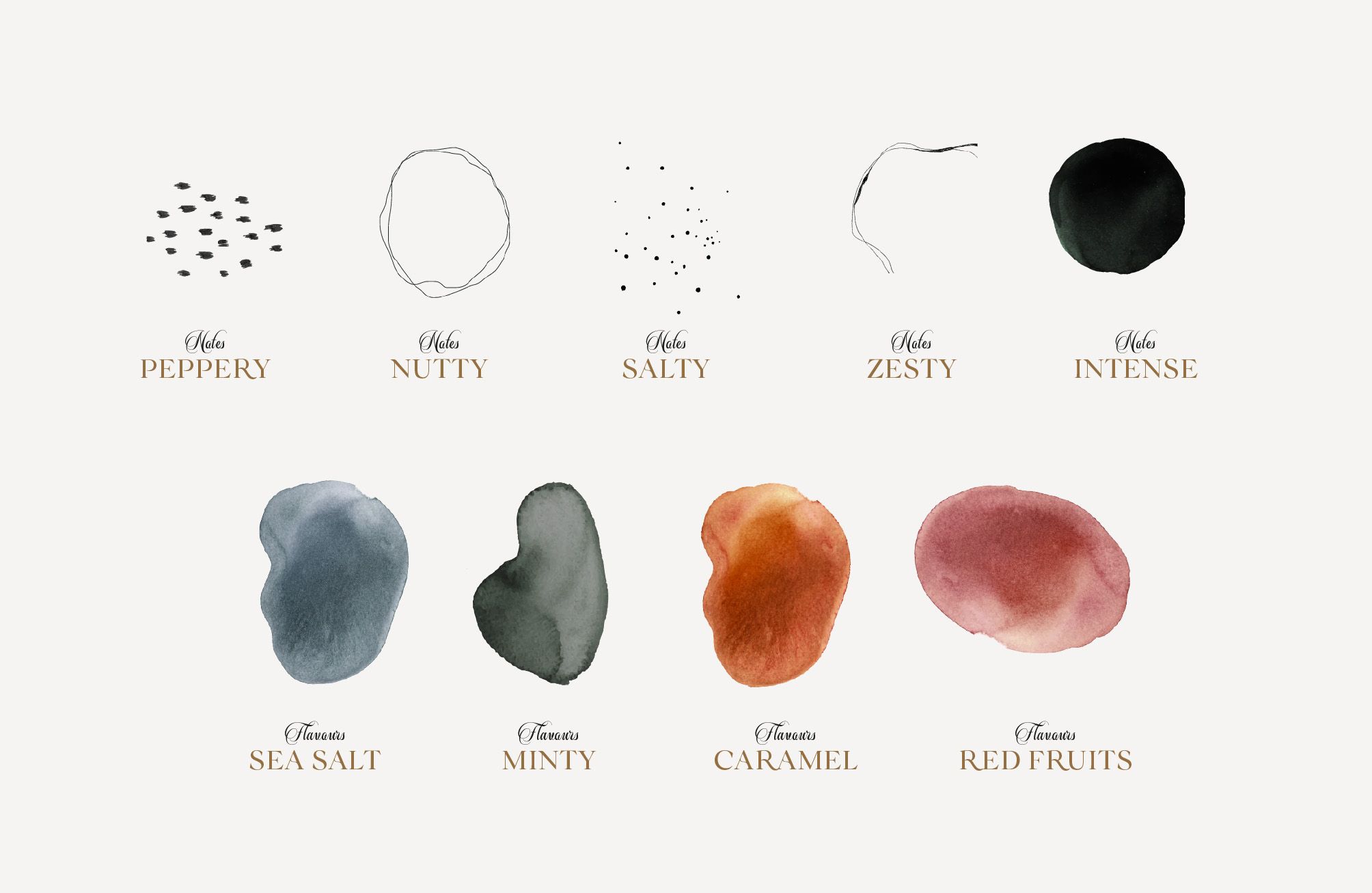
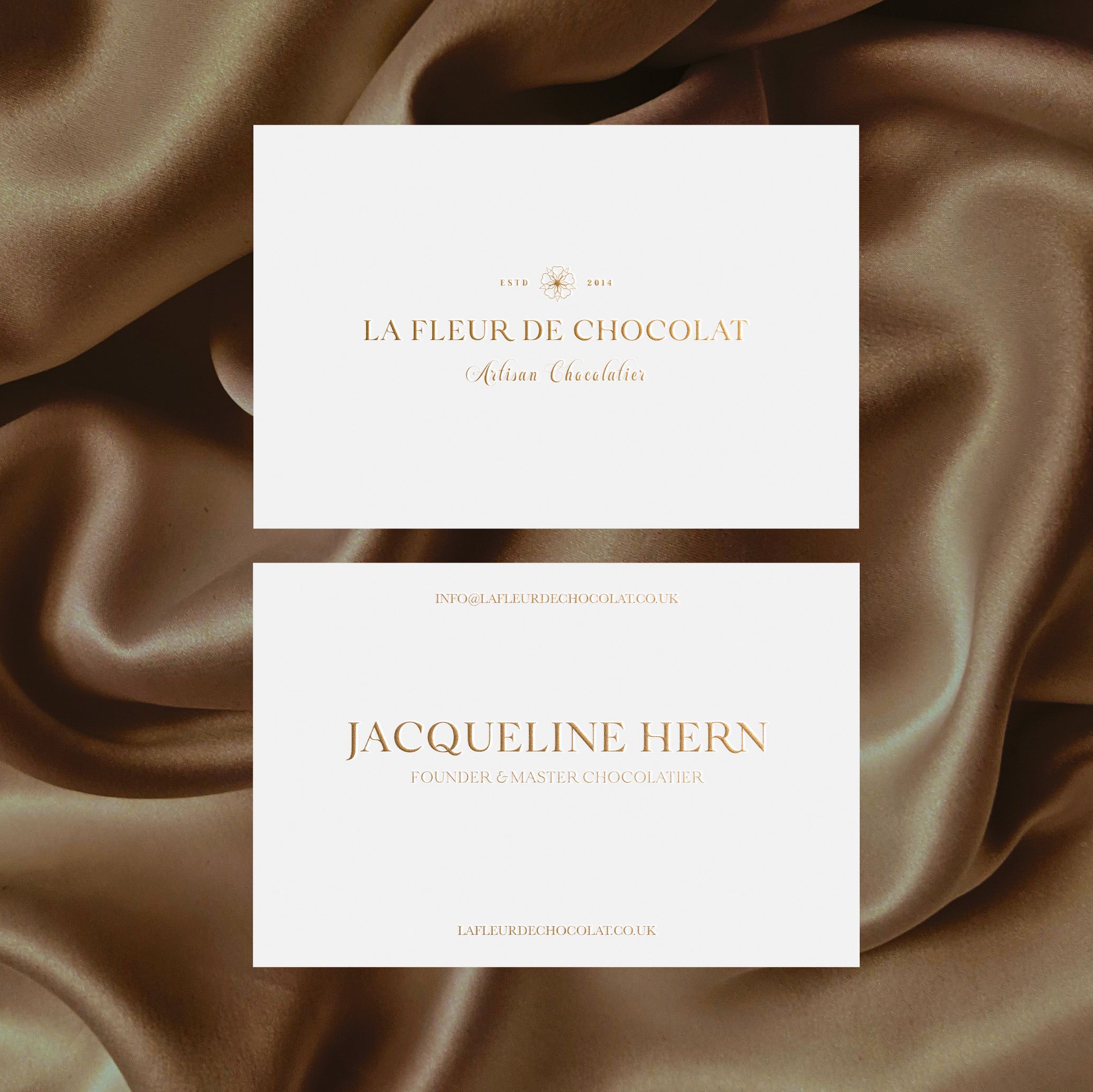
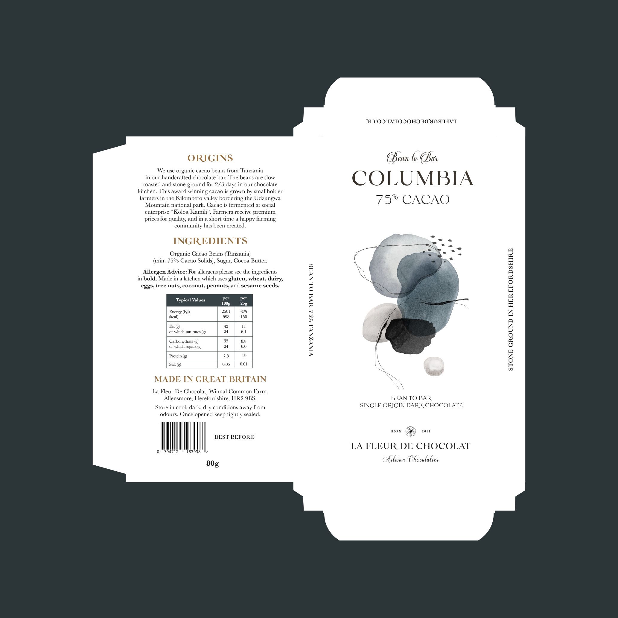
We saw an opportunity to play on the parallels between the world of chocolate and art, whilst concurrently composing a timeless brand by stripping everything back to the essential elements. Colour, and its absence played a transformative role by selecting a predominantly white colour palette which is synonymous with luxury, whilst adding tints of rich browns taken from the cocoa pod. Gold embossed foil, and quality paper stocks allowed us to dial up the volume on print and packaging but still retain an understated feel.
