The Client
The Barn
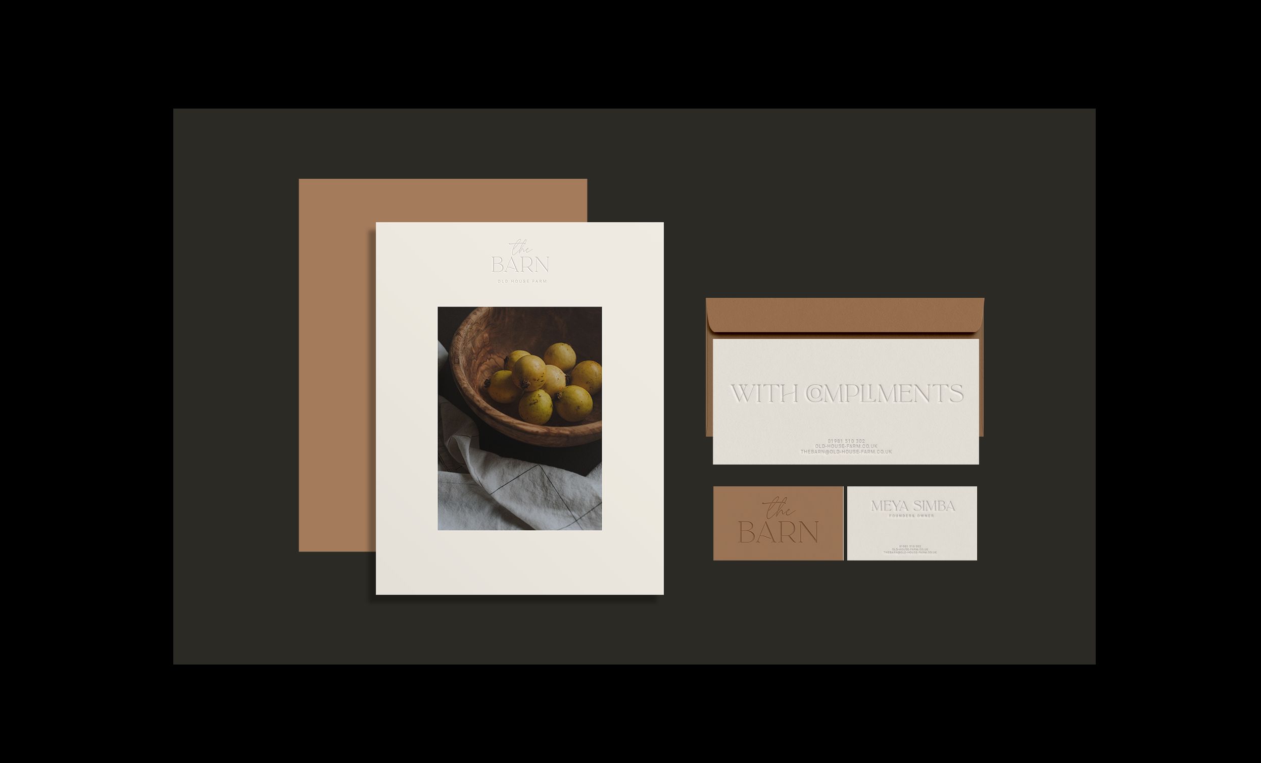
Brand strategy + brand identity + print + website
Rustic
Luxury Retreat
In the wake of a global pandemic, which dramatically altered the landscape of hospitality, we knew that uk holidays needed to feel different, new, and meaningful. It quickly became apparent ‘a place to stay’ was selling the barn short, it was in fact all about people, human connection and how it made them think and feel. It was more than a mid-week break, weekend trip, or an escape to the country; it was an opportunity to reconnect with ourselves and others.
Imbuing
trust & fuelling desire
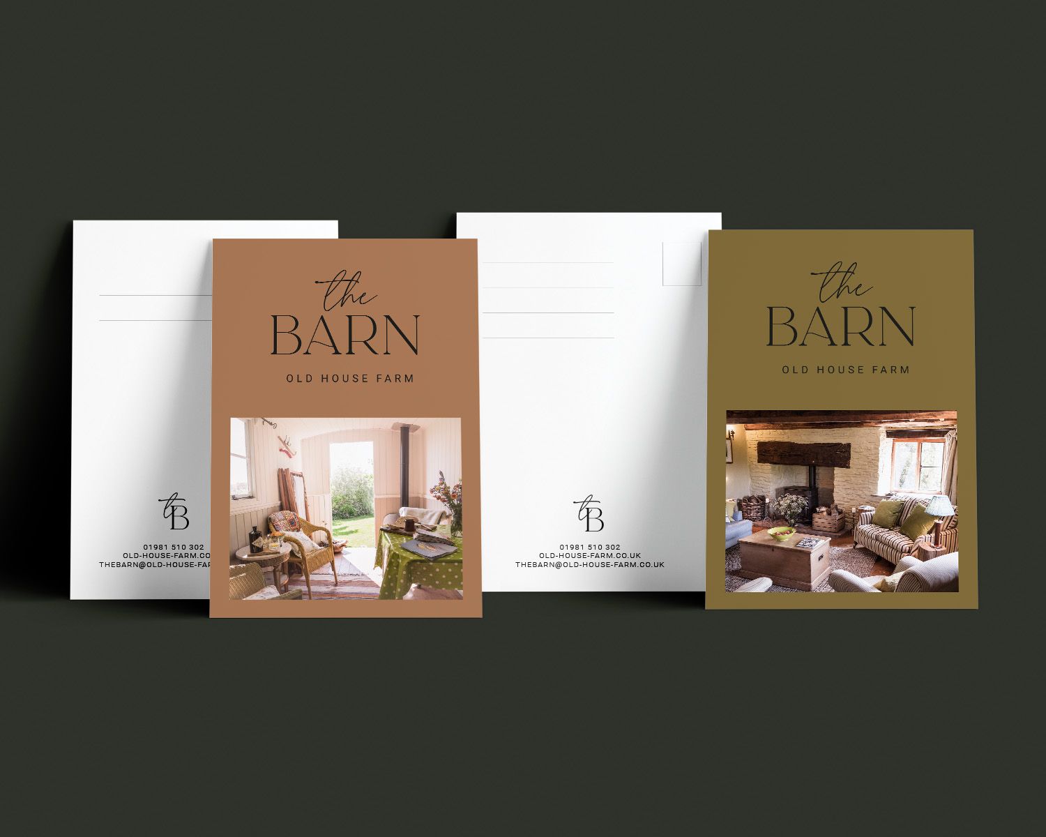
We consciously moved away from conventional high-end branding to reflect a more understated, authentic and personal look and feel, producing a visual identity that connects and celebrates the unique facets of the barn.
Retreat to the hills
We were born to explore, discover, celebrate and make memories
Capturing
Connection
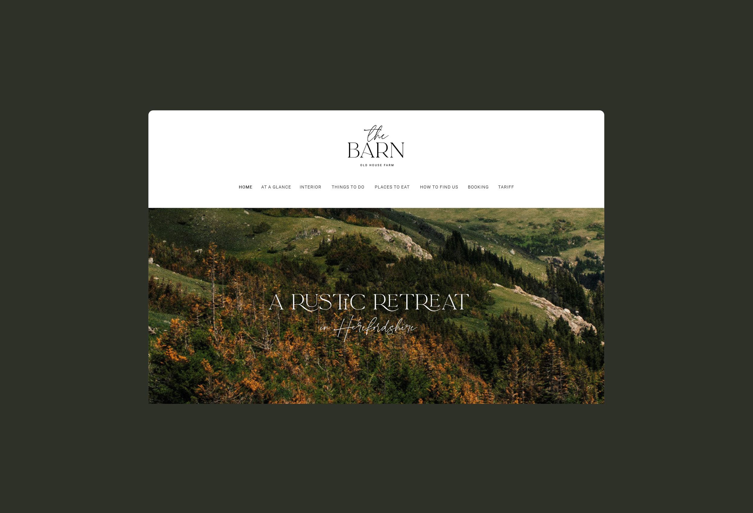
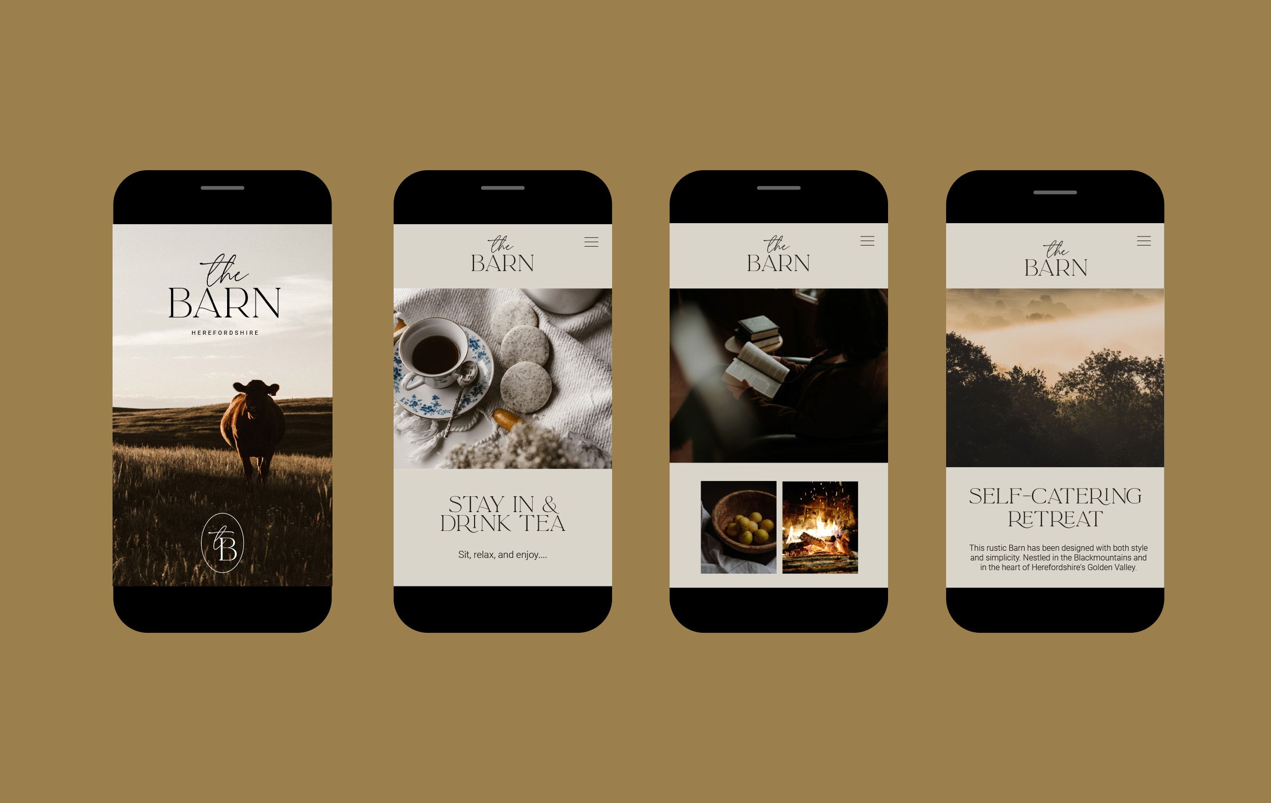
We were asked to undertake a full visual refresh, from the creation of a new strategic positioning through to print, art-direction and web design. Our ambition was to give the barn a new visual spirit, capturing moments of transportation to another place, even if only fleeting. We helped the barn to distill what it meant to be 'away' for guests, by embodying themes such as escapism, time, relaxation, connection and nature. This was about re-establishing what luxury means - one that lets you stay in your pjs, read a book in a cosy corner, rest your feet on the sofa, one that makes you feel truly comfortable 'at home'. By giving the barn greater meaning and purpose in connection with its surroundings and to their audience we were able to reach out to their consumers on an emotional level.
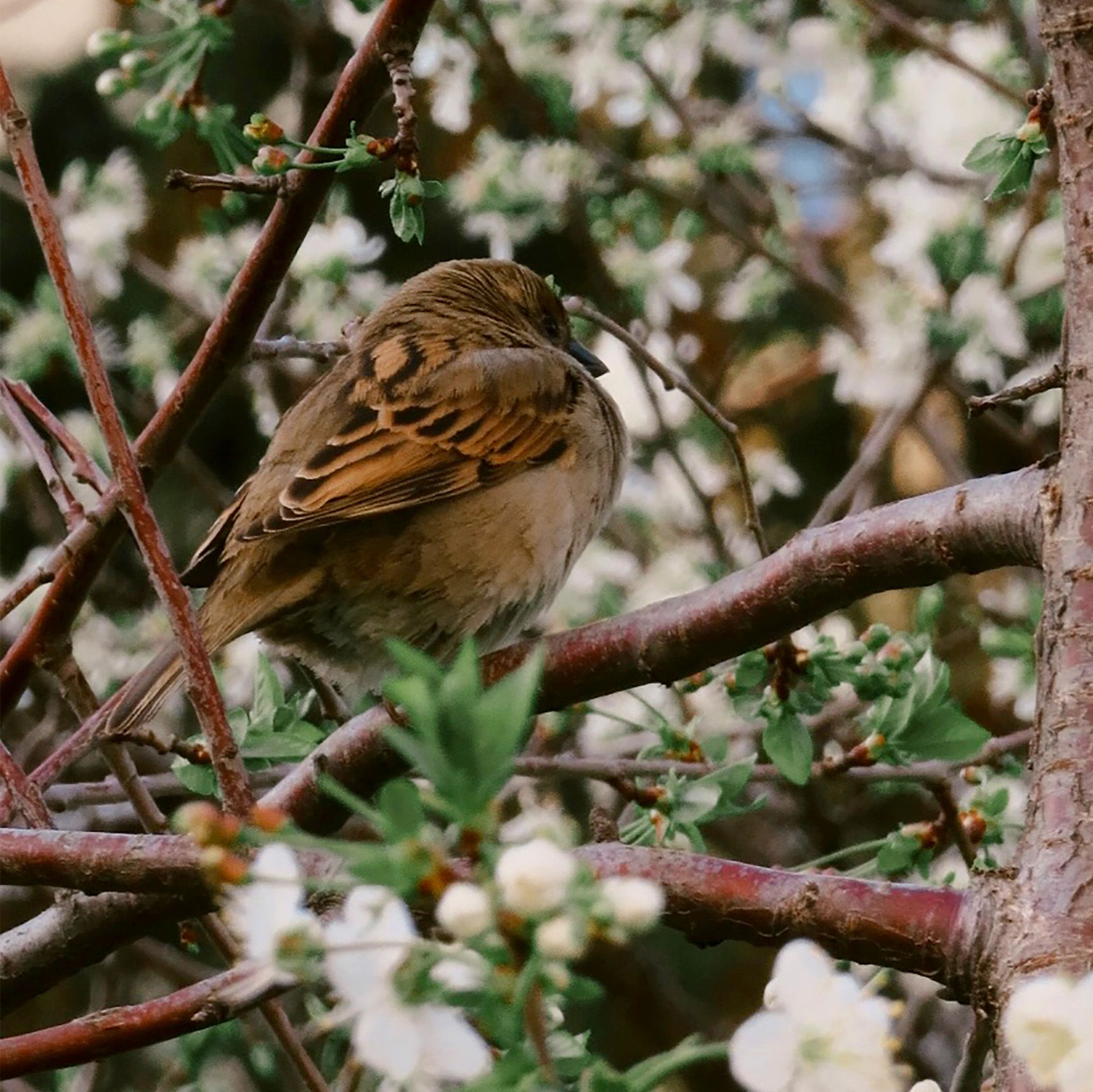
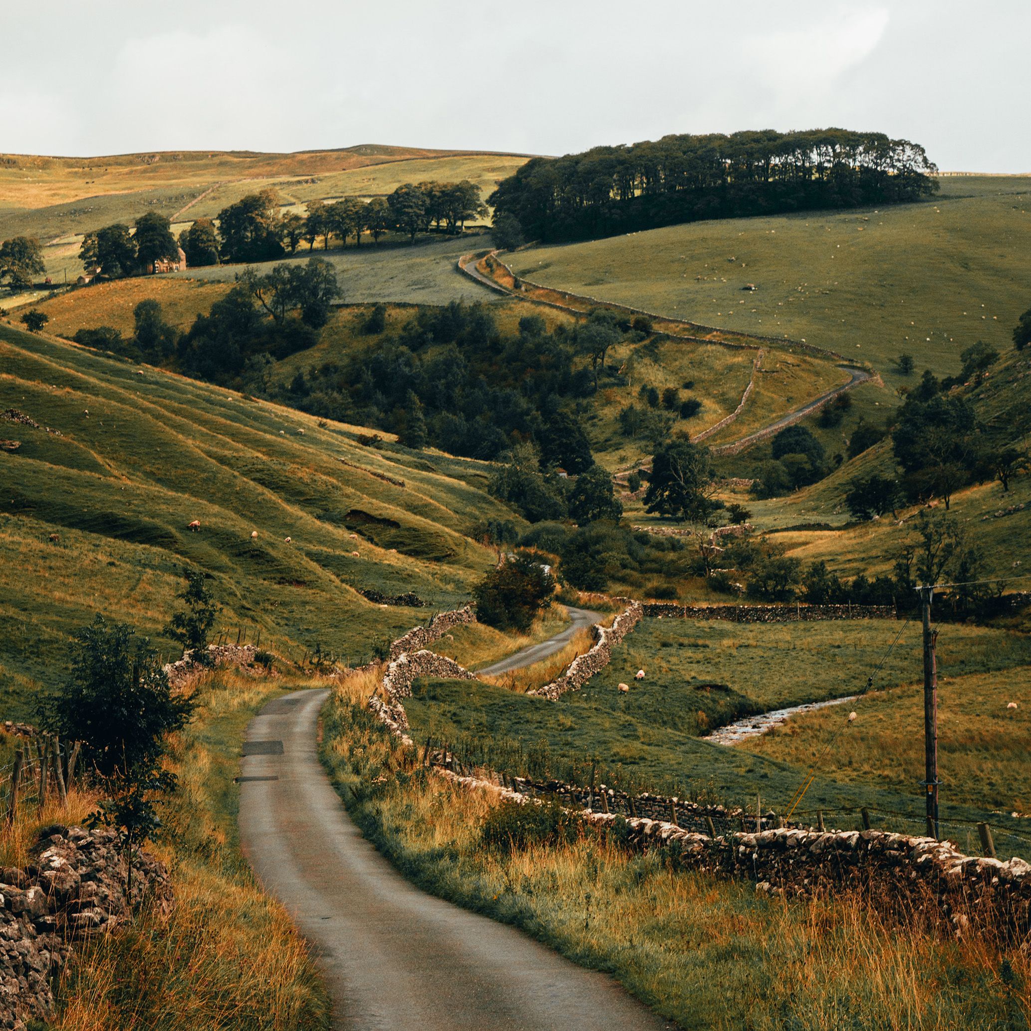
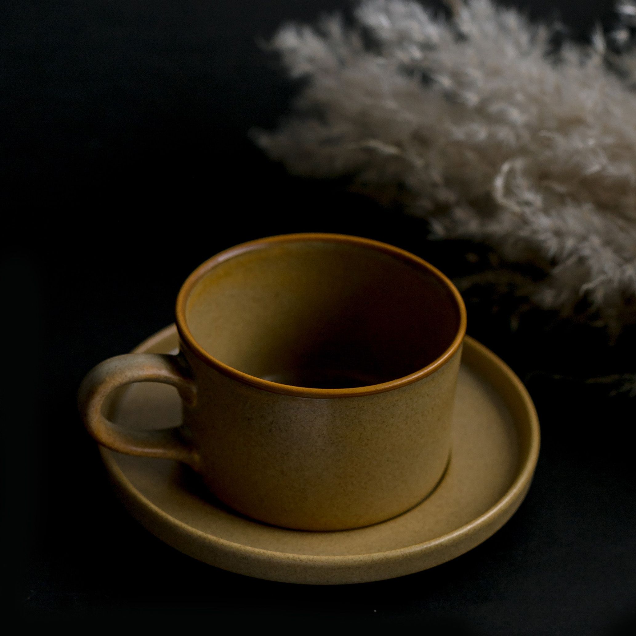
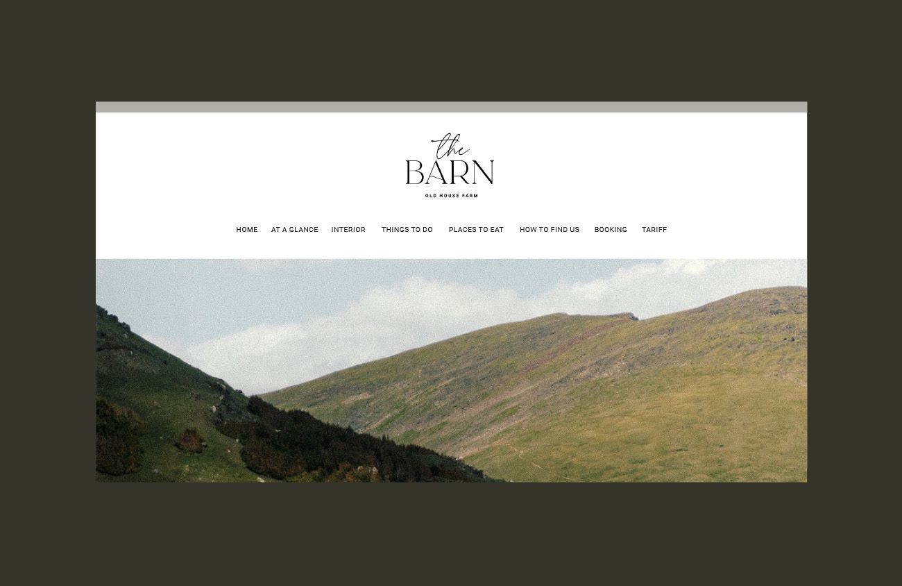
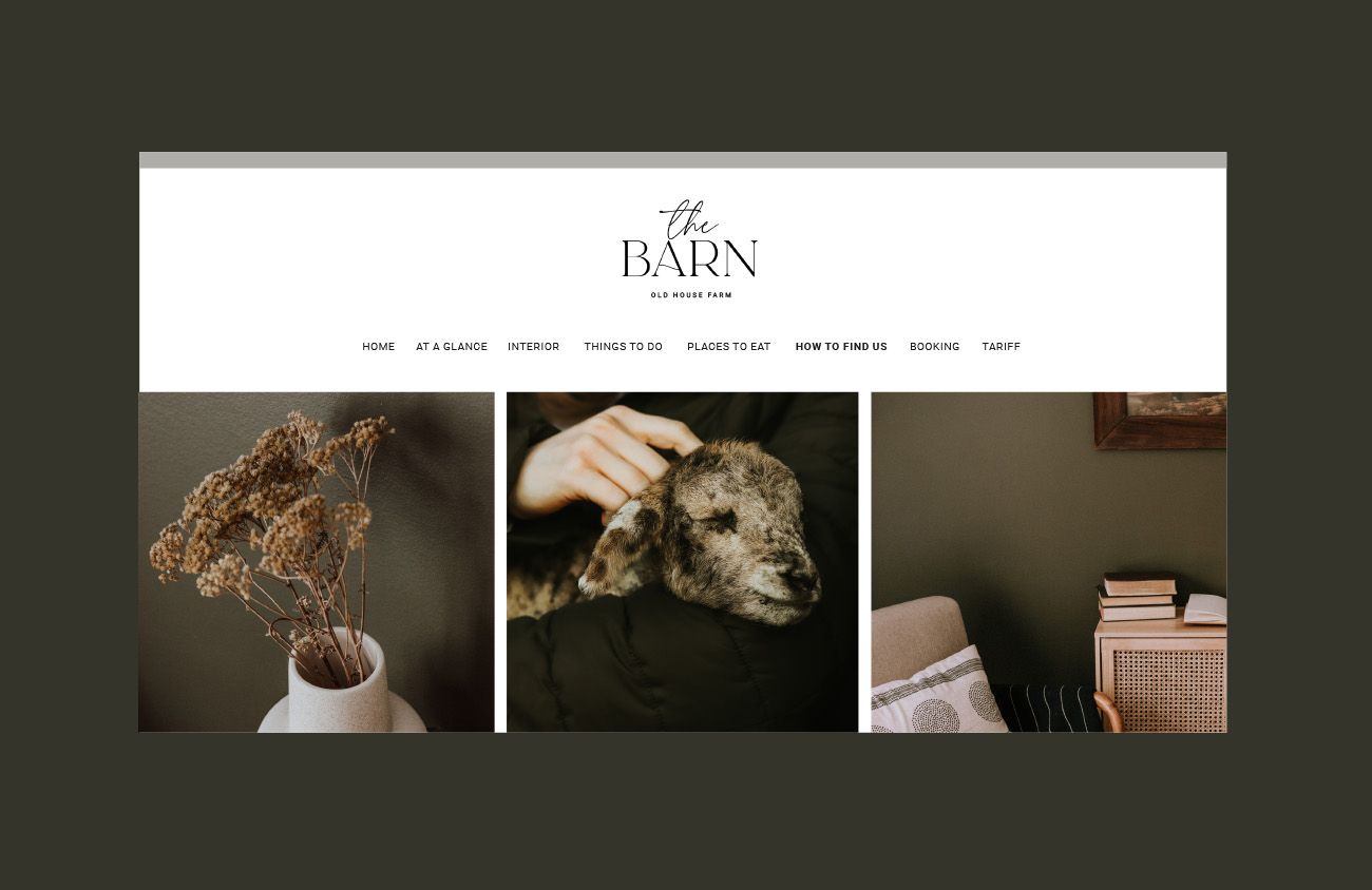
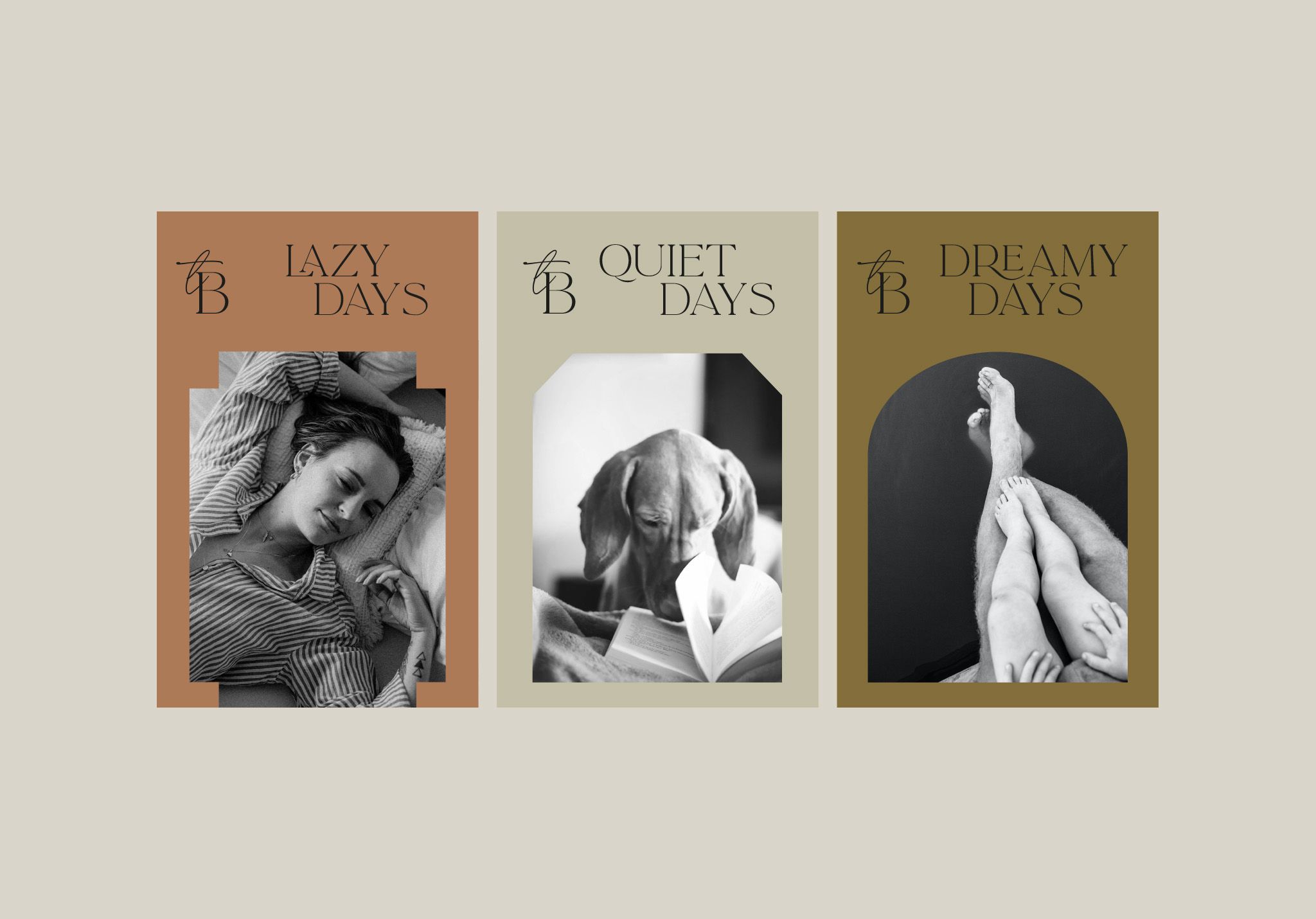
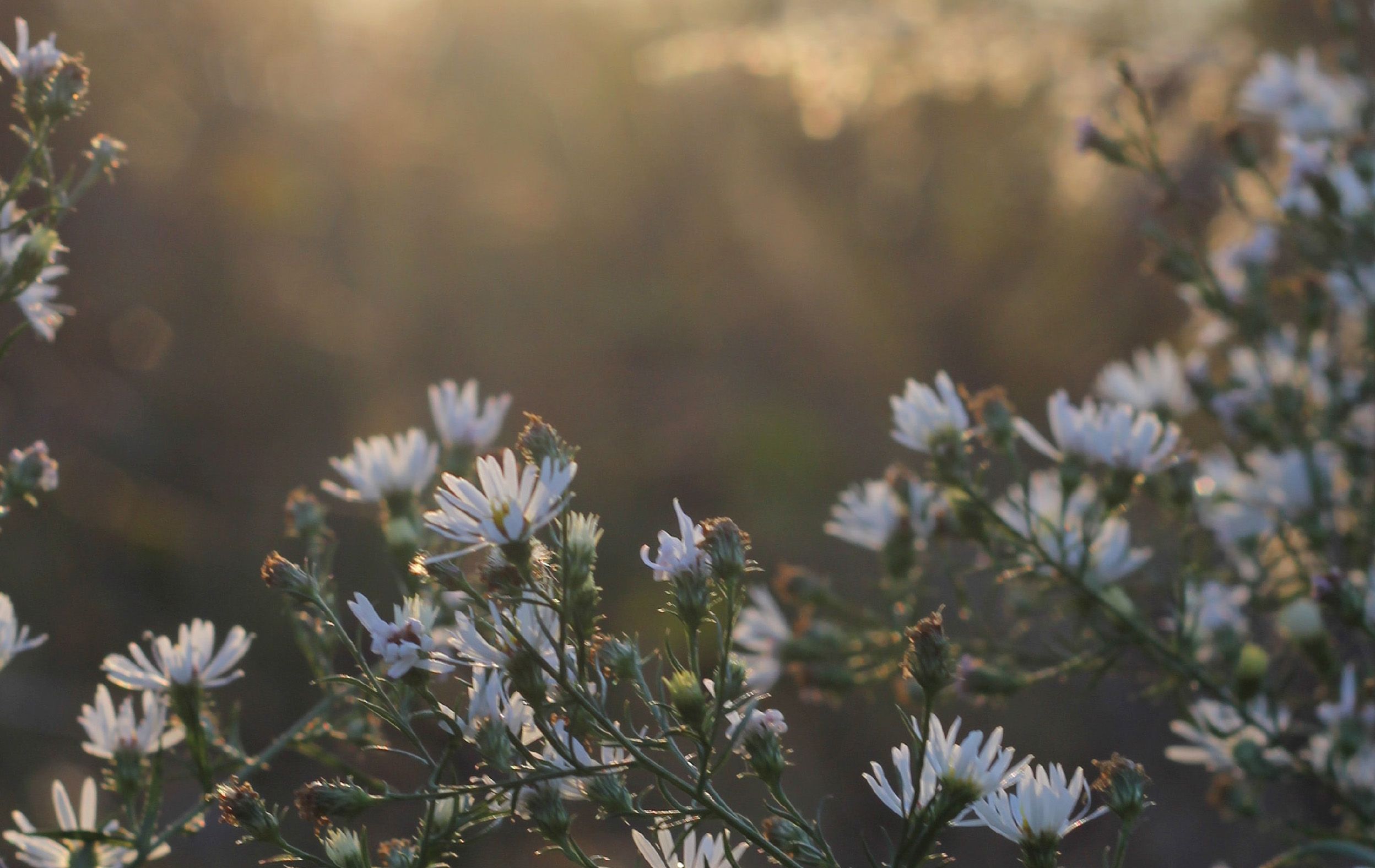
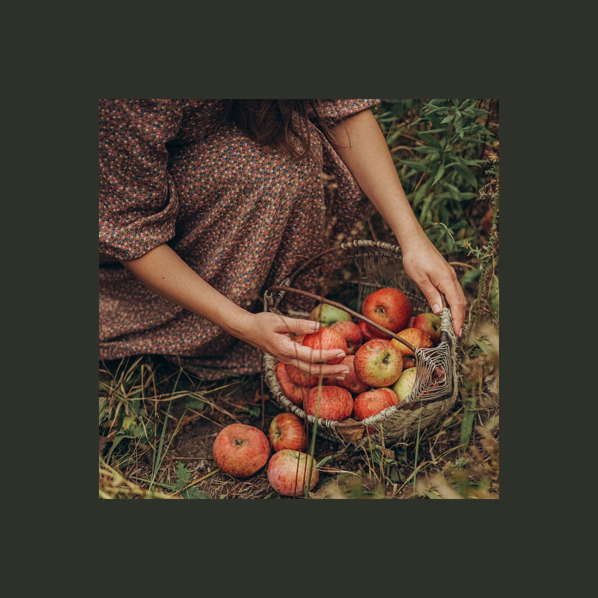
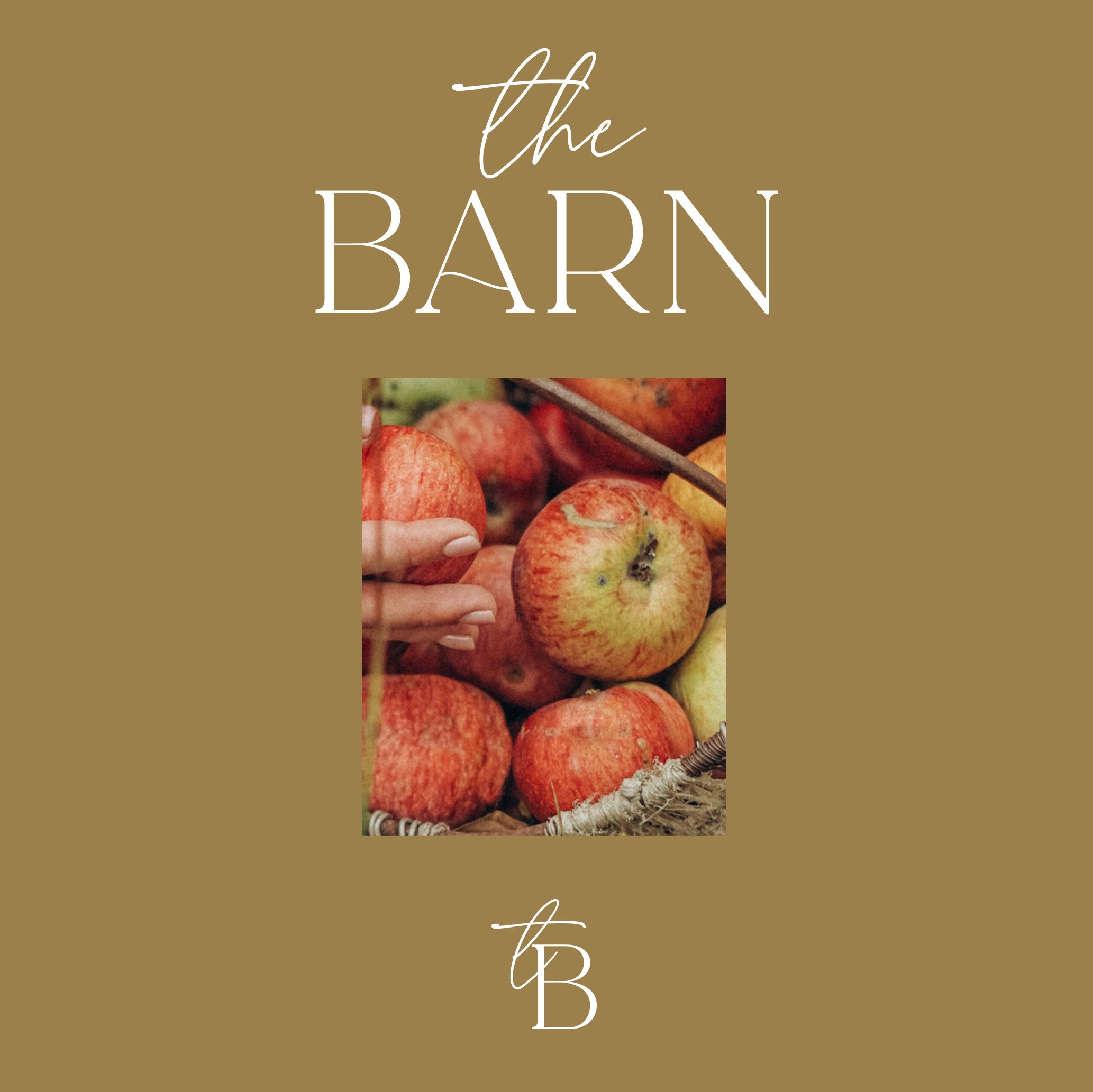
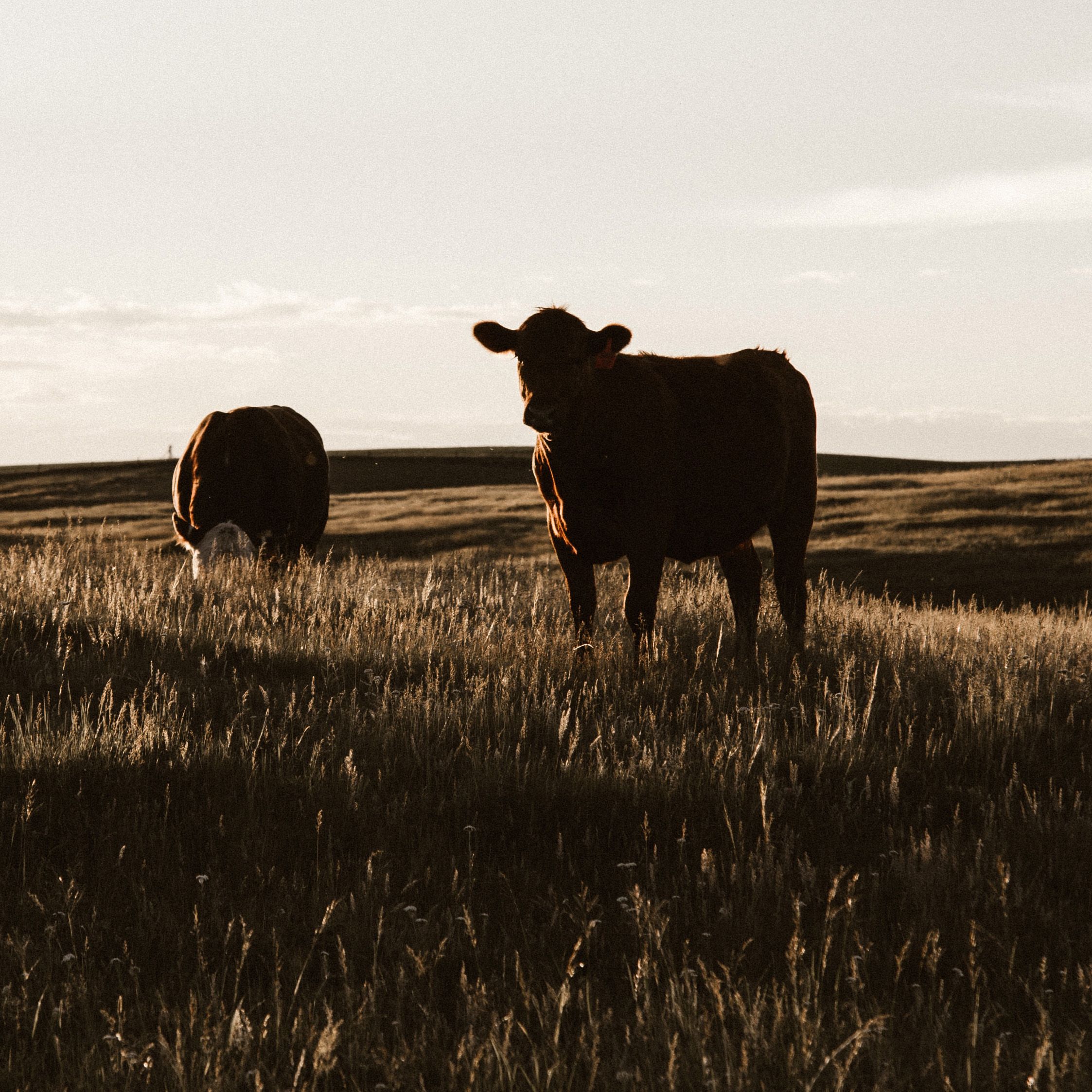
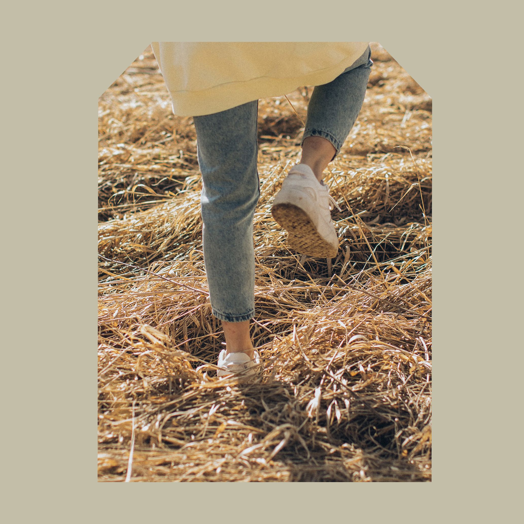
A key part of the new identity was bespoke photography that depicts the barns experience; the quieter moments, the fun, the adventures, the connection. Working across three tiers the photography focused on; real candid shots of people, textural close ups of nature, and the interaction between humans and nature. The holding devices used to frame the imagery resembled elements from the local historic and architectural landscapes such as castles, churches and hills. Infusing these elements together, alongside an earthy natural colour palette creates a native yet modern identity.
Beauty
in simplicity
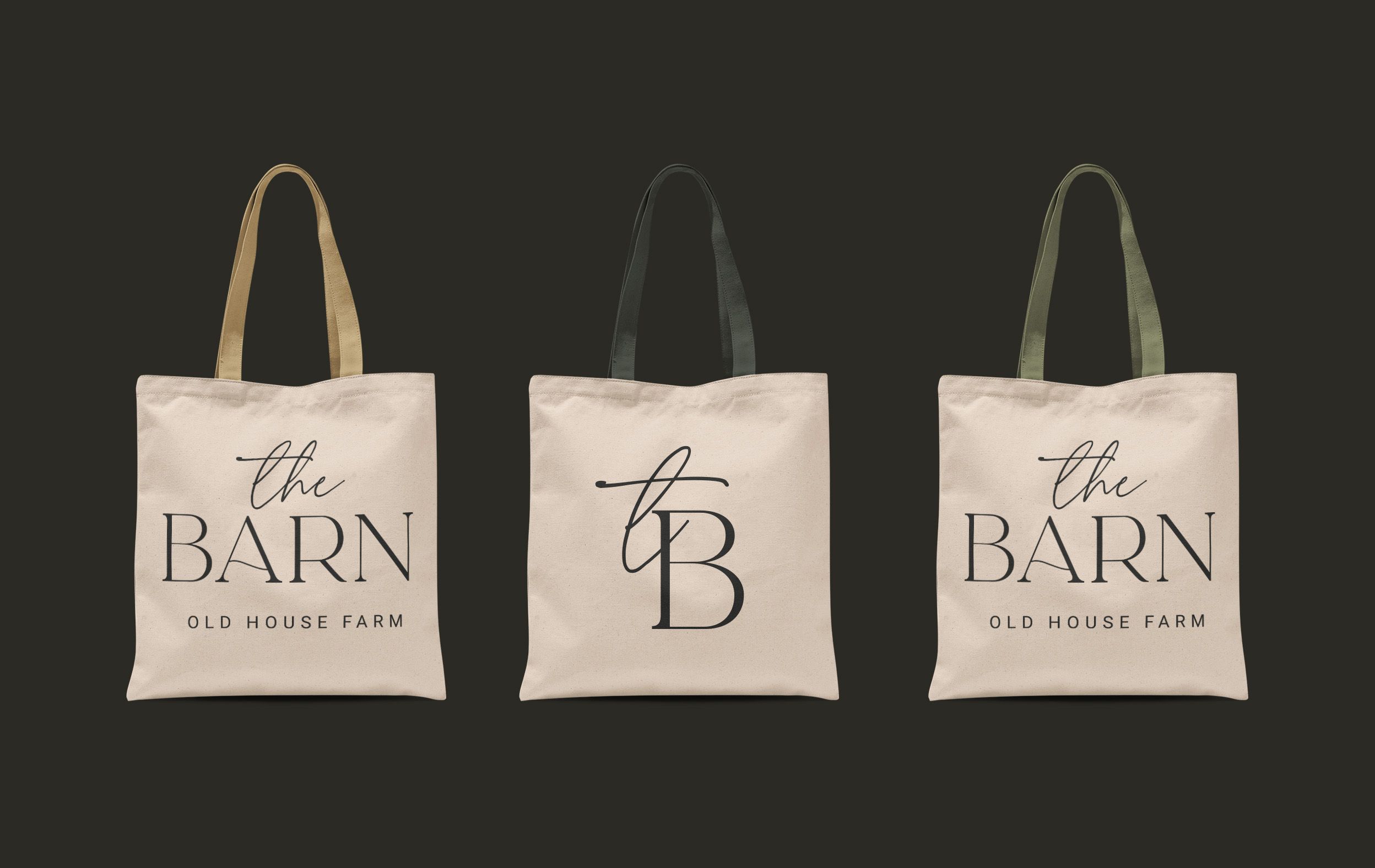
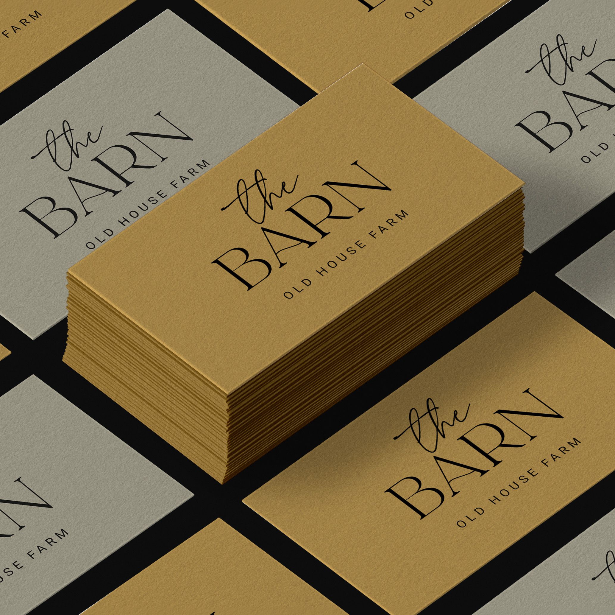
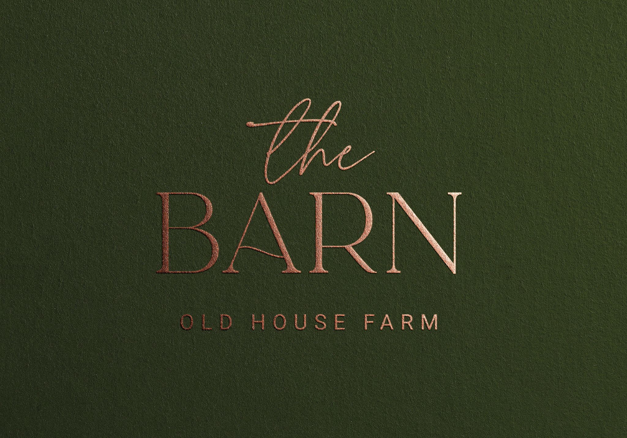
We developed a fluid logomark to evoke natural materials such as the oak inside the barn, whilst emulating the rolling hills and mountains it resides in. This subtly contrasted with the transcribed type echoing a simple, artistic and human touch.
